1948 Leaf Stan Musial #4
Reviews & Discussions
9 total reviews

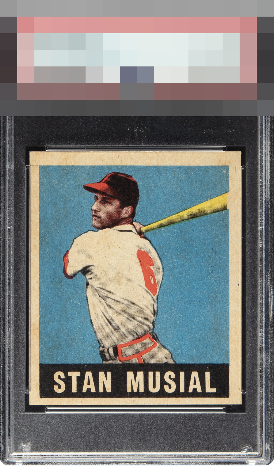
Centering and what looks like soiling hold down the eye appeal despite great registration and corners.

Sharp corners, but I am not a fan of the centering or the dirt that seems embedded in the surface pretty uniformly.

Still presents well but the surface toning bothers me and centering is off.

I like the solid light blue in this print version and the only improvement for me is the centering. Great card and it is centered nicely compared to most 48 Leaf cards.

Such a clear image of him with the red in the right spots, yet the centering does jump out as being off.

the image looks like it POPs and the Bat really stand out. But the off centering of the card, the staining of the card and the surface wear hold the card back for me to truly enjoy it

The registration is so good, yet the centering creates a hard ceiling for eye appeal to me. Would trade softness in one of those corners for better centering. My eye also catches some toning in the borders, which I would certainly look past if the centering was there.

Great looking image and excellent registration. Centering and border toning hold it back.

EyeQ+
EYEQ+ TROPHY CASE


Rating Distribution
9 total reviews
Amazing copy except for the centering. Slight toning at and near the borders is evident but doen't bother me on this card. Strong registration, color, corners and edges. Love it.