1949 Bowman Stan Musial #24

Reviews & Discussions
11 total reviews

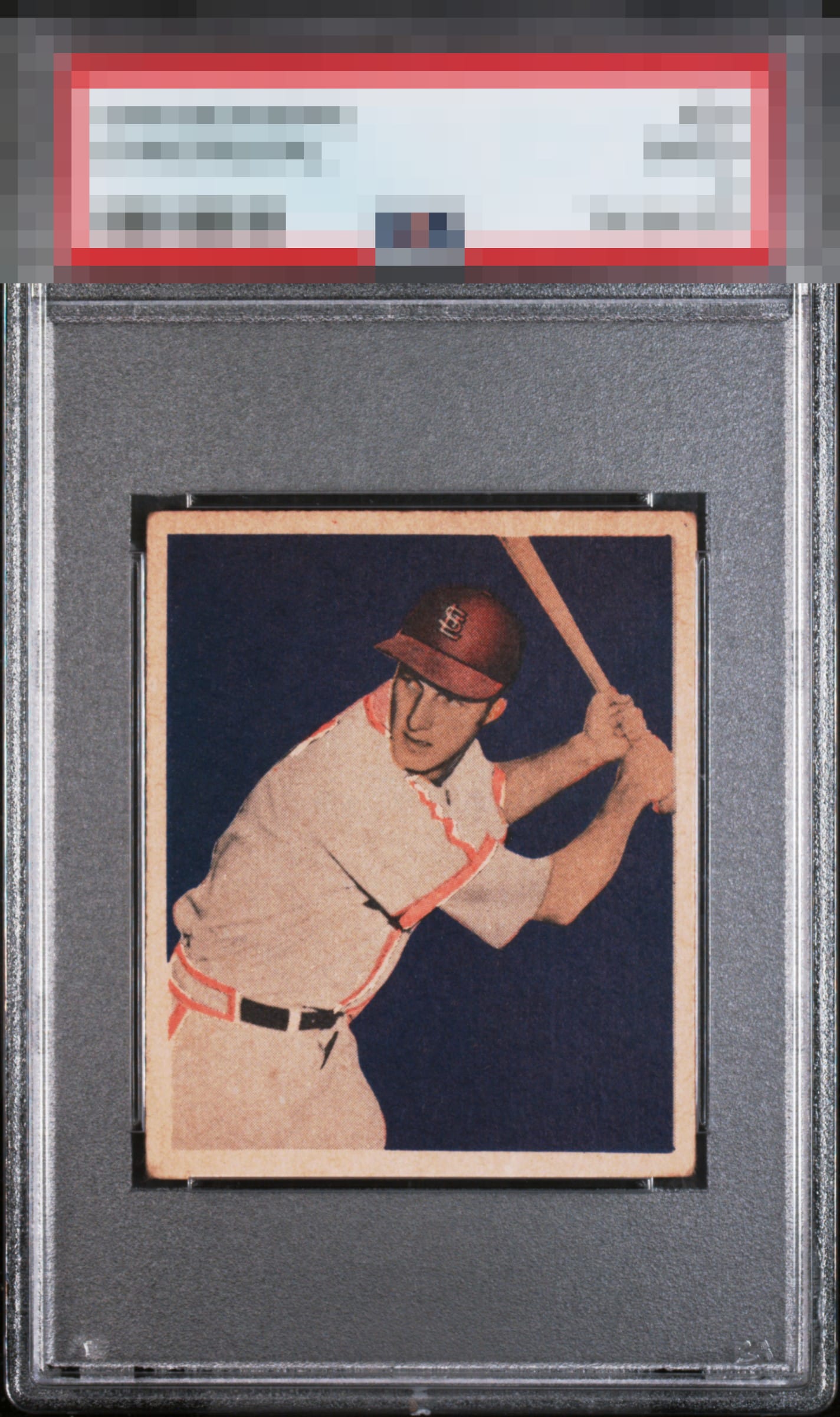
The great attributes of this card shine brighter than the flaws hurt it, is the bottom line. The background's solid color, the image's focus, and the centering win me over. The toning and corners factor in, yet not enough to dislodge the eye appeal from the highest echelon.


Look at that deep, rich background color with not a blemish in it. Then the centering AND the registration!


The image focus and color and centering are all A+. Just some honest corner wear and toning, Beautiful top tier eye appeal. This will have a monster EyeQ score for sure.

Love the centering and the dark blue background. The toning at the top of the card is noticeable compared to how clean the bottom of the card is.

Like the card and size of the borders and the centering. However, there is to much discoloring on the top and right sides that affect the overall eye appeal.

Nicely centered and focused image. A bit of toning on the card. Presents very well.
EyeQ+
EYEQ+ TROPHY CASE


Rating Distribution
11 total reviews
The defects of corner wear and toning exist technically, but aesthetically they are little more than background radiation. This example may be confiscated during the first wave of my subjugation of humanity.