1953 Topps Satchell Paige #220
1 / 2
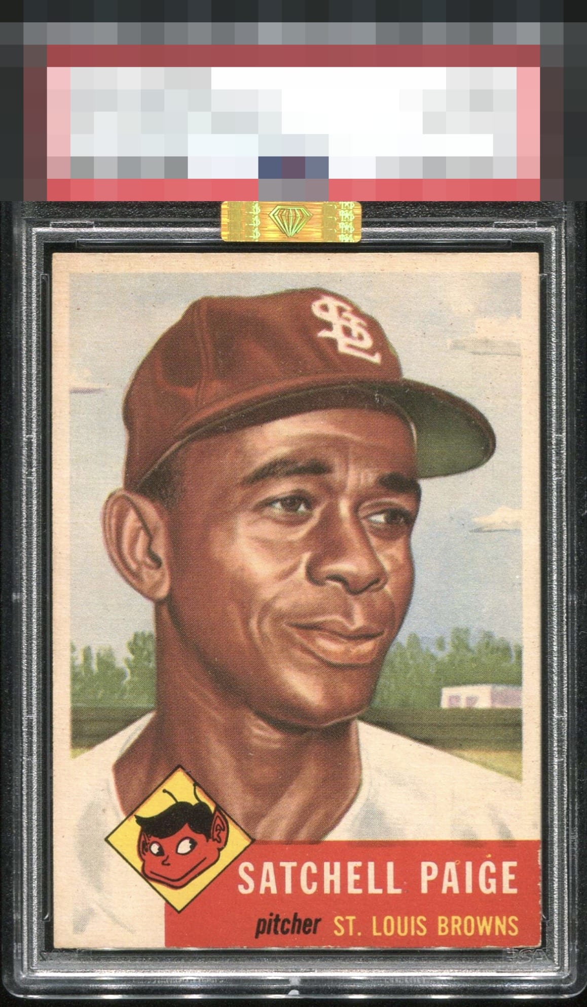
Click to enlarge
💬
Reviews & Discussions
11 total reviews

This copy appeals to me, just a nudge of centering and mild PD and wear in the red corner but nothing major.

Light surface wear and some edge wear are all that hold this back.

Stunning card! Centering is top notch, and colors and image are very strong along with the bottom red corner which shows just a touch of wear.

Centered to the south, and that's the only aspect that bumps my eye.

card is good mid tier card but the card has some toning that darkens the card and the red box has nicks that make it distract and also effect the colors and image

Locked
4 reviews
EyeQ+
128.0
Global Population
19
POPULATION ACROSS ALL GRADES AND GRADING COMPANIES
Global Eye Rank
#11
Population in Grade
1
POPULATION IN THIS GRADE AND GRADING COMPANY
Eye Rank in Grade
#1
EYEQ+ TROPHY CASE

GLOBAL
1st Place
IN-GRADE
📊
Rating Distribution
11 total reviews
G
0%
A+
0%
A
2 ratings
29%
2
A-
3 ratings
43%
3
B+
0%
B
2 ratings
29%
2
B-
0%
C+
0%
C
0%
C-
0%
D+
0%
D
0%
D-
0%
F
0%
Top tier eye appeal for my money. Some edge wear and PD in the red and top centering stop short of the full A but that is it.