1953 Topps Satchell Paige #220
1 / 2
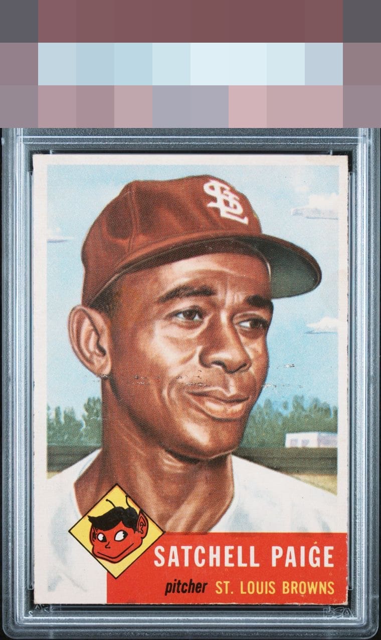
Click to enlarge

💬
Reviews & Discussions
3 total reviews

This is an interesting copy. When I come across a card like this in the wild of eBay or shows, I always ask myself, "Would this flaw hit me at my everyday viewing distance?" Normally, any flaws in the subject's face, or where my eyes spend most of their time, has outsized impact on aesthetic appeal. But on this specimen the horizontal line is not something I am as fixated upon as I would think, at first blush. Centering alongside it does make impact, and the red zone sports only modest wear. Good overall looks to me.


3 of 7 reviews

0 reviews
EyeQ+
--
Global Population
8
POPULATION ACROSS ALL GRADES AND GRADING COMPANIES
Global Eye Rank
—
No Eye Q+ score
Population in Grade
4
POPULATION IN THIS GRADE ACROSS ALL GRADING COMPANIES
Eye Rank in Grade
—
No Eye Q+ score
EYEQ+ TROPHY CASE

GLOBAL

IN-GRADE
Trophies appear here when earned.
📊
Rating Distribution
3 total reviews
G
0%
A+
0%
A
0%
A-
0%
B+
0%
B
1 rating
33%
1
B-
1 rating
33%
1
C+
1 rating
33%
1
C
0%
C-
0%
D+
0%
D
0%
D-
0%
F
0%
shame the colors are solid the image is strong. But the horizontal crease and marks near face and around it are to much for me. Add to it the damage to the red area (which always seems to have damage on these cards) limits its upside for me