1953 Topps Satchel Paige #220

Reviews & Discussions
10 total reviews

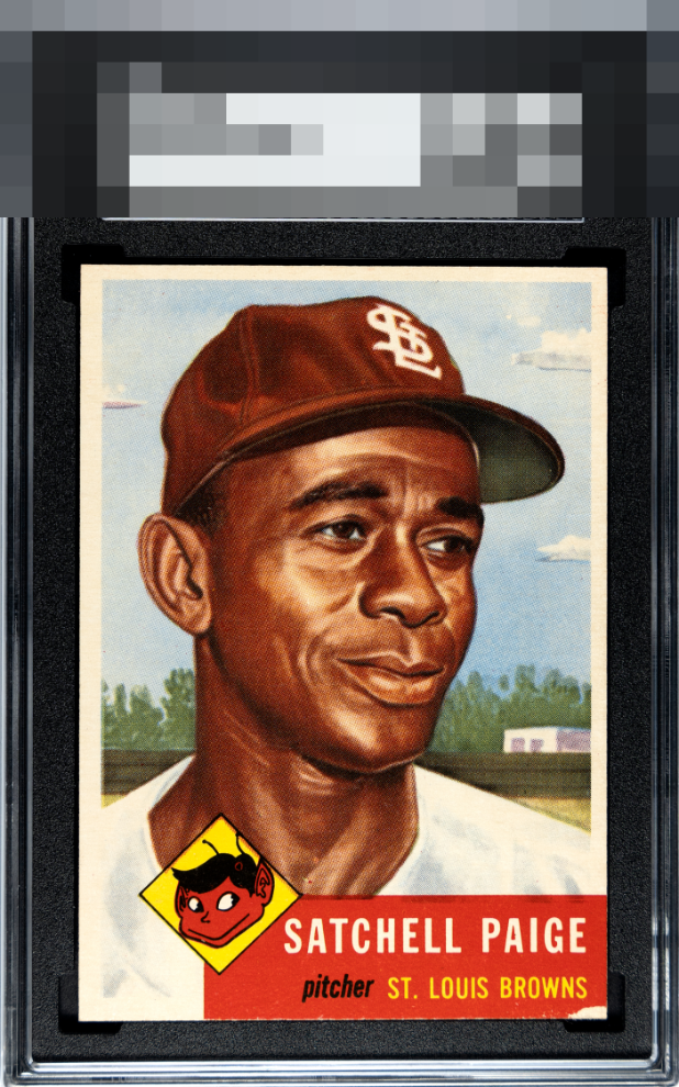
This is a stunning copy but that corner keeps it off the A tier for me. But everything except that corner is exceptional.

This card is great in color, image, centering, and corners. That paper loss throws me, but it does not take much away.

Even with the centering and the lower right corner damage, this card has that swagger I was just talking about with another member. You know it when you see it, and this has it so the badge is much higher than I would think at first.

Can’t award an A due to the obvious corner but man is the rest of the card a stunner.

Beautifully crisp image with strong color that immediately caught my attention. For me, it’s held back in the B tier due to what appears to be damage along the bottom.

This one really wins on clarity. The print registration is strong, the image looks sharp, and the overall presentation feels clean and confident. Centering is fairly good for the issue, which is often the battle with cards like this. The red runs a touch light to my eye, and there’s a small spot of paper loss on the lower right corner that keeps it from feeling pristine up close. Even so, it doesn’t derail the eye appeal. Overall, it’s an excellent card with very little to nitpick.

Normally that lower right corner would cap eye appeal at a C+ for me, but this image-- it just is so crisp and the colors so bold, the other three corners are minty, too. And this is from a centering stickler!

The colors and image just jump off screen. Centering and the paper loss on the bottom right where the red border is does distract a bit.

From afar the card has the Wow factor but as you move closer it still nice but loses the Wow. Strong image and colors but has centering opportunities, surface stains and the red box chip off the corner holds it back

EyeQ+
EYEQ+ TROPHY CASE

Rating Distribution
10 total reviews
I can't pretend that the paper loss on the bottom right doesn't exist. I still like it though, the color really pops. It's a neat copy.