1953 Topps Satchel Paige #220

Reviews & Discussions
10 total reviews


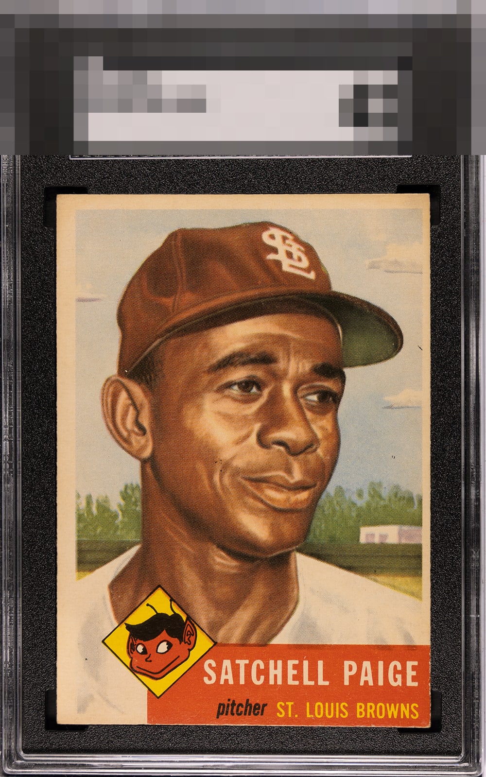
This is an excellent copy for Paige. Take that OC away and whitening by the red and you’ve got yourself an A-Tier card.

Centering is rough, but the corners are good. Color isn't as strong as some examples, but the image stands out.

A little bit of natural tone & centering push just barely keep it from an A. Still very clean Satch.

While the centering looks off, it’s well disguised by the light background against the white border. The overall presentation earns a very nice eye appeal score from me.

The image looks nice. Centering is the main issue but there is quite a bit of toning and the color has dulled as a result.

Punches high due to image clarity and a great red section. Toning is uniform so my eye is not bothered by it. Corners also strong. As a centering guy, that aspect is what holds the beauty grade to the B Zone for me.

Love the image as it jumps off the page. But the borders, discoloration of the borders, and the off centering of the borders holds it back. Enjoy the card and enjoy the image just leaves you wanting more


EyeQ+
EYEQ+ TROPHY CASE


Rating Distribution
10 total reviews
Possesses strong visual character and classic eye appeal, anchored by several standout attributes that give the card exceptional presence. The corners retain sharpness and structure that help the card present with notable freshness for the issue. Surface quality is equally impressive, appearing clean and undisturbed, which allows the image and background colors to display attractively without distraction. The color is strong, showing rich saturation and vibrancy that gives life and immediacy. Paige’s facial details appearing clear and focused, enhancing the portrait’s expressive quality and overall visual sharpness. A particularly attractive feature is the lower right nameplate area, which presents especially well and adds to the card’s aesthetic balance. On many '53 Topps, the nameplate can become visually compromised by chipping, but here it remains clean and appealing, subtly strengthening the overall composition. The primary weakness is a noticeable centering shift to the lower right, especially troubling because the card's anchor is the nameplate in the same direction. While the imbalance is visible, the card’s strong color, sharp print quality, and clean structural attributes offset it considerably.