1956 Topps Sandy Koufax #79
1 / 2

Click to enlarge
💬
Reviews & Discussions
8 total reviews


Centering really wins here. I can live with the flaws which include that print snow.

Fantastic centering on this copy and bright colors to pair with it

nice looking card and nice and bright the way i like them. Bit to much surface wear that holds back the overall appeal

Centering is God Tier with surface wear that counterbalances that aspect.

Locked
1 review
EyeQ+
124.0
Global Population
10
POPULATION ACROSS ALL GRADES AND GRADING COMPANIES
Global Eye Rank
#5
Population in Grade
2
POPULATION IN THIS GRADE AND GRADING COMPANY
Eye Rank in Grade
#2
EYEQ+ TROPHY CASE
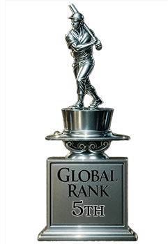
5th Place
GLOBAL

2nd Place
IN-GRADE
📊
Rating Distribution
8 total reviews
G
0%
A+
0%
A
0%
A-
2 ratings
29%
2
B+
3 ratings
43%
3
B
2 ratings
29%
2
B-
0%
C+
0%
C
0%
C-
0%
D+
0%
D
0%
D-
0%
F
0%
Centering isn't bad, a little off top to bottom. The surface wear, including white spots on his face, is the main issue.