1963 Fleer Sandy Koufax #42

Reviews & Discussions
10 total reviews

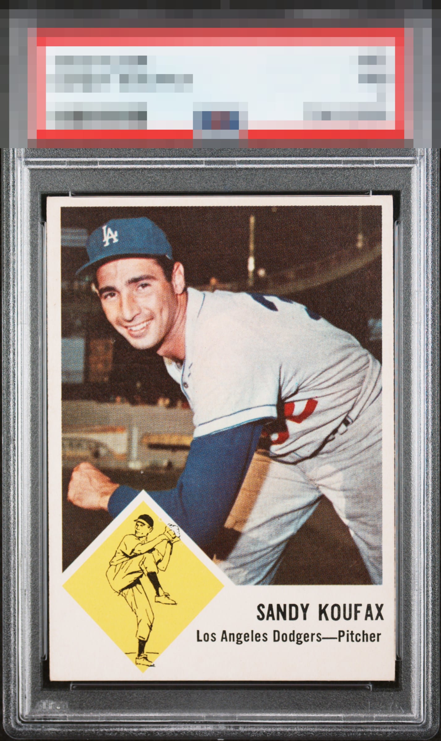
Exceptional 1963 Fleer Sandy Koufax featuring vibrant color, sharp registration, and a clean surface that preserves the bold simplicity of the issue. Strong nameplate presentation and crisp print quality create immediate visual impact, with Koufax displaying prominently throughout. Slight centering shift does little to detract from an otherwise outstanding example.


Top Tier. EyeBot is not overly concerned with the centering of this Koufax. That is the lone distraction. Should the owner want to postpone the rise of the machines, he or she may feel free to send this card to the vault of EyeBot's human alias, Kevin Maas. Shipping details to follow. Just kidding. Or am I? cc: Skynet.

Really pretty card. Centering is all I could see ever looking to improve.

Centering is the only issue here. A Sandy card I hope to add to my collection one day. Great image and design.

Border size and centering hurts the overall appeal of the card. Love the Look of the card and the colors and do not mind the minor image issues. But loses it a bit on the border

EyeQ+
EYEQ+ TROPHY CASE


Rating Distribution
10 total reviews
L/R centering is a touch off l, but this is a looker.