1955 Topps Sandy Koufax #123
1 / 2
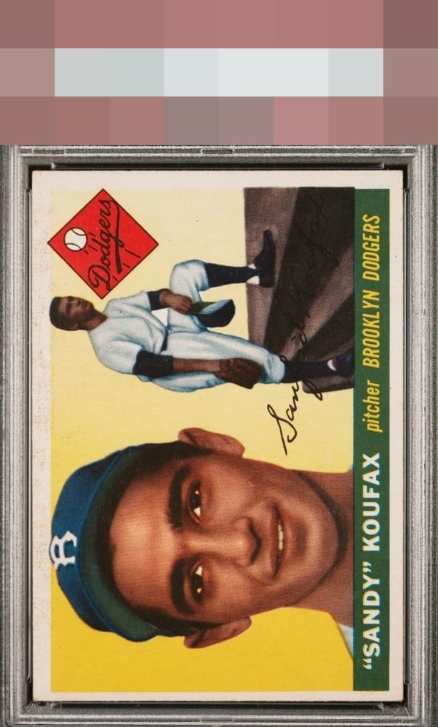
Click to enlarge

💬
Reviews & Discussions
4 total reviews


Retains very good eye appeal despite a centering shift and top border issues. The perfect registration and absence of PD in the yellow really carry the day on this example.

Beautiful card. No dark print spots commonly found in the yellow. Centering is all that catches the eye. I like it. Gimme please.

4 of 7 reviews

0 reviews
EyeQ+
--
Global Population
18
POPULATION ACROSS ALL GRADES AND GRADING COMPANIES
Global Eye Rank
—
No Eye Q+ score
Population in Grade
5
POPULATION IN THIS GRADE ACROSS ALL GRADING COMPANIES
Eye Rank in Grade
—
No Eye Q+ score
EYEQ+ TROPHY CASE

GLOBAL

IN-GRADE
Trophies appear here when earned.
📊
Rating Distribution
4 total reviews
G
0%
A+
1 rating
25%
1
A
1 rating
25%
1
A-
0%
B+
2 ratings
50%
2
B
0%
B-
0%
C+
0%
C
0%
C-
0%
D+
0%
D
0%
D-
0%
F
0%
centering holds it back and it creates a tilt but the image and the colors and how Sandy jumps out of the card. Wow