1955 Topps Sandy Koufax #123

Reviews & Discussions
7 total reviews

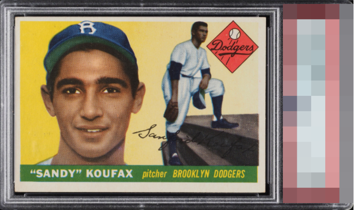
OC but in the right direction for it not to be offensive. Sharp card.

Centering keeps this from much higher bands that its other attributes would easily merit.

The image looks nice and the surface is clean. The centering is quite a bit off though and stands out to me.

I think the main images and the colors are good. They do not pop but they are clean and easy to enjoy. The opportunity is the borders that are off center and mis sized so it does not frame the images well

Colors and image look very strong. Surfaces look clean. Main issue is the centering.

Centering looks a bit off to me and the borders don't appear perfectly balanced, which you feel more on a card like this. There's also what looks like some light surface wear that takes a little bit of the edge off the overall pop for me. Still presents well overall.

EyeQ+
EYEQ+ TROPHY CASE


Rating Distribution
7 total reviews
Centering is really the only flaw I could seek to improve on what is otherwise a top tier looking example. Mild PD by his cap is easily shrugged off and only emerges on a deep long look.