1955 Topps Sandy Koufax #123

Reviews & Discussions
10 total reviews


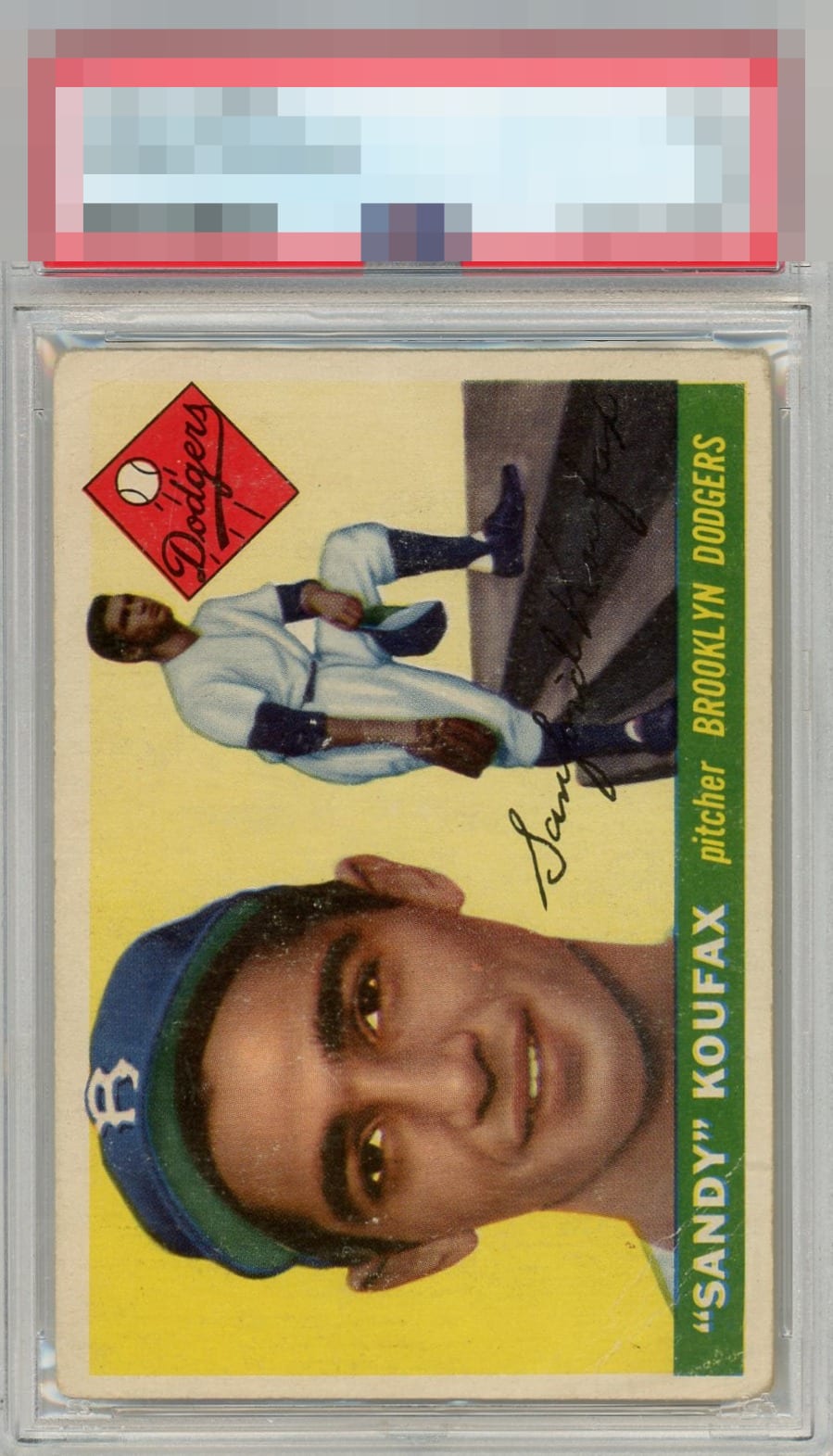
Centering isn't bad, a little off top to bottom. Surface has a lot of wear, including small creases and white marks around his face.

Good amount of wear yet it does not add up in a way that knocks the eye appeal too much.

Decent eye appeal here. For me, the subtle tilt and surface issues keep it back from the next level.

It presents well though there is an immediate awareness of general wear.

No one thing that bothers the eye, rather just a case of generalized wear across the (card)board. Still presents well and flirts with a B- for me.

Has charm and great centering. The overall wear reaches a level where I notice yet none of the wear aspects rise to enough of a distraction level where it sinks into the C Tier for me.

At first glance the card looks good. As surface wear and color issues blend in and are not noticeable but as you look closer there is to much surface wear, the card is off center, the corners have damage and the borders are not bright and crisp. It is a nice card as the main images look good and the colors are respectable. Just to many opportunities that hold it back


EyeQ+
EYEQ+ TROPHY CASE


Rating Distribution
10 total reviews
A nice example of a beat up card still looking pretty good.