1955 Topps Sandy Koufax #123

Reviews & Discussions
12 total reviews

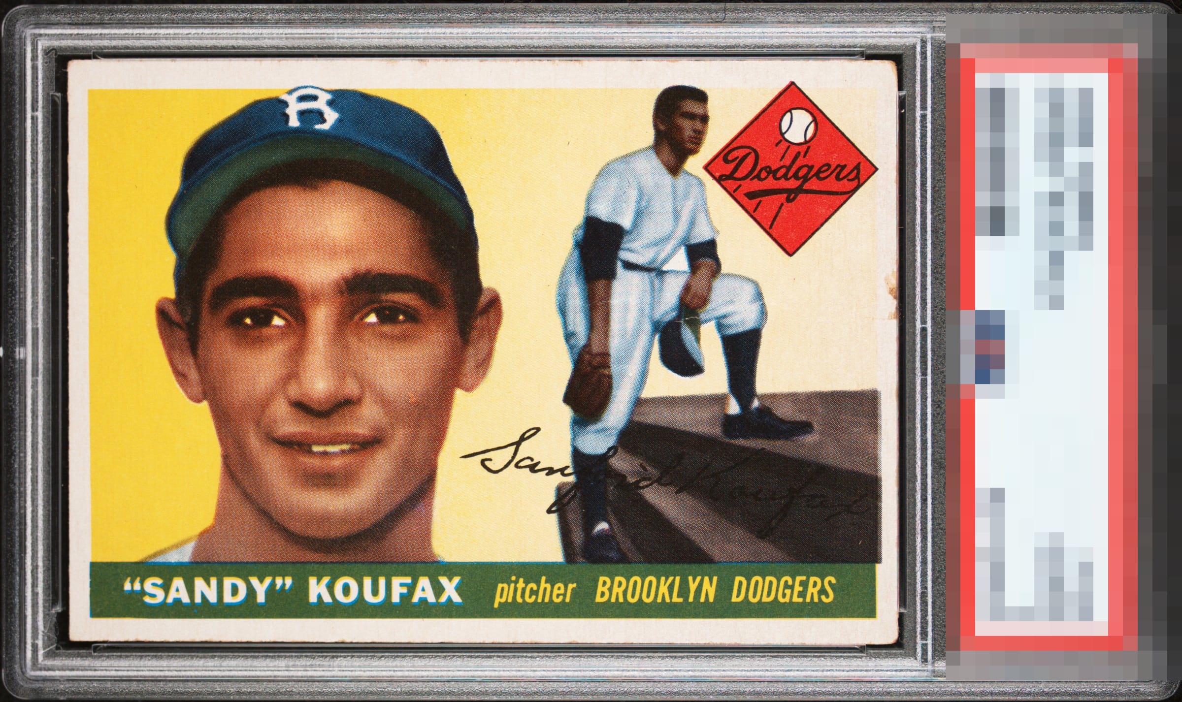
That edge ding probably keeps the cost of this very pretty overall example down, yet it also keeps the eye appeal from climbing into the top plateau of badges.

That patch of edge wear is the only eye appeal flaw to me on this Sandy. The centering is awesome and so is the print quality. I dig this copy!

From the "red Dodgers diamond" looking left is a high A. From the "red Dodgers diamond" looking right is a C.

This card punches way above its weight. Aspects that please the eye include the unblemished yellow area, the great centering, and the bold overall color. The edge wear in the right is the sole eye appeal flaw, and does knock it down to a still very high B badge. Excited to see the EyeQ+ for this beauty.

Without that right edge wear, wow. It still pleases my eye and that wear is in the perfect spot not to bother me.

The color and both images on the card look great. The mark on the right border doesn't hurt the eye appeal much for me, and centering is a little off, but this is a nice low grade example.

Love the brightness of the card but do not like the right side border of the card. The borders are off center but decently sized THe image is strong and the colors are good. To me the right border really hurts it

Love the image and colors on the card. Edge wear especially the right border does distract my eye.

Beautifully centered and no major surface issues. The issue on the corner is the only item distracting the eye and I can look past it for the grade. Great copy.
EyeQ+
EYEQ+ TROPHY CASE


Rating Distribution
12 total reviews
Great color and centering. Slight registation issue and the chocolate staing on the right side and teh uneven wear on teh corners detract.