1961 Topps Ron Santo #35

Reviews & Discussions
11 total reviews


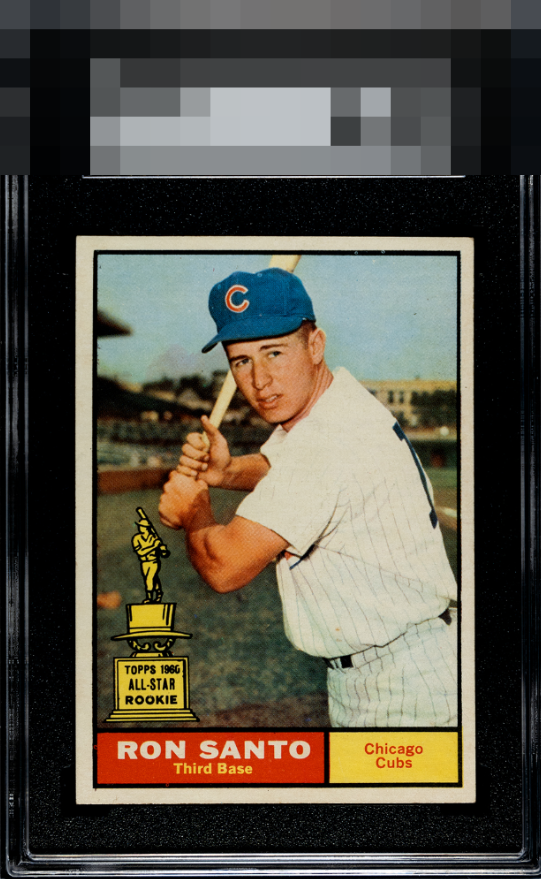
Pleases the eye a great deal. Centering is all I can see that I could hope to improve on this beauty.

Presents well to the eye, only centering could be improved. The corners are more than fine to my eye, regardless of what is seen under a loupe. My eyes have no magnification LOL.

I see some surface wear, I see left right centering opportunities and I see the borders can be a bit brighter. But When I stand back to enjoy what I see is a great looking card with nice bold borders, sharp image, good colors and a Walk down Memory Lane

Very bold colors and image. I see a few PD and fisheyes on the top black outline. Centering is a touch off. Presents very well.

Love the All-Star Rookies-- they inspired the trophies here. This card looks great, with centering side-to-side being the sole eye appeal drawback. Mild PD in the top black border is negligible to me. Love when 61s have clean name and team boxes free of PD.
EyeQ+
EYEQ+ TROPHY CASE


Rating Distribution
11 total reviews
Centering is my only issue here. Love the Topps All Star Rookie trophies! Mild PD in the top black border also is noticeable but with better centering this makes the A Badges.