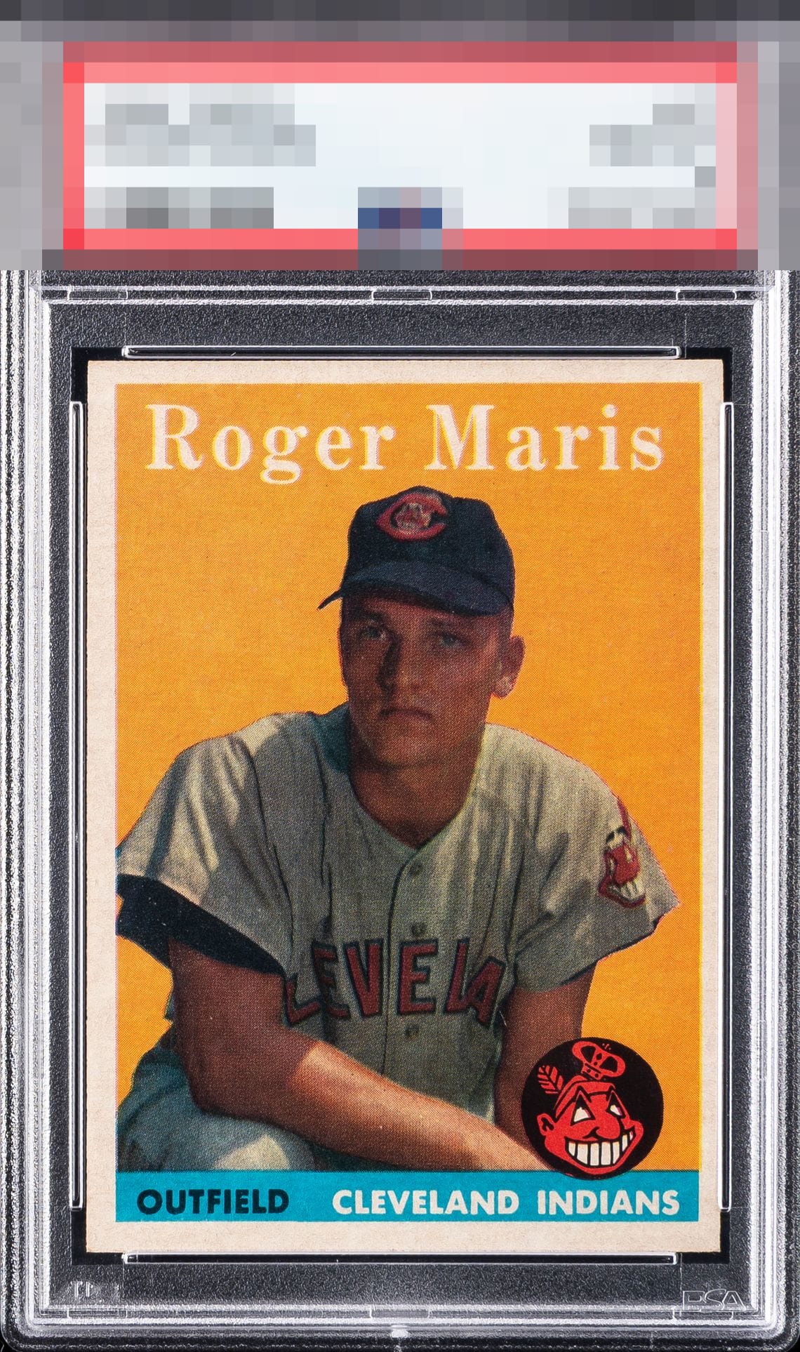
1958 Topps Roger Maris #47
Reviews & Discussions
12 total reviews

I suspect time travel was involved somehow. Well chosen, my human friend. A whisper of centering from God Tier Status. Deep in my code, this card is inspiring envy. Acquisiton protocols engaged. cc: Skynet.

A beautiful Rog rookie. A big fan of this card and this is a beautiful example: great print, bold color, clean surface, white borders and corners, + good image and registration. A skosh of centering is all that keeps it from GT.

Appealing overall presentation, highlighted by strong color and well-balanced centering despite a slight rightward shift. The nameplate and Indians logo both present sharply, adding strong visual definition. A few minor surface distractions keep the card from reaching a higher visual tier, but they do little to diminish the overall experience in hand. Overall, attractive Maris with strong color, balance, and vintage charm.


Top Tier aesthetics. Centering is the only aspect I would think could be improved but good luck doing that and keeping the rest identical!

Simply love the look. Solid image, colors, nice size borders, and good enough centering(L/R holds it back)


This is a seriously solid card with great eye appeal; the only flaw that I'd cite is centering, and it's only off enough to make a minor impact.

Great looking Maris, with just a bit of centering and focus the only minor dampeners.
EyeQ+
EYEQ+ TROPHY CASE


Rating Distribution
12 total reviews
Great color and image. Slight centering shift is the only issue.