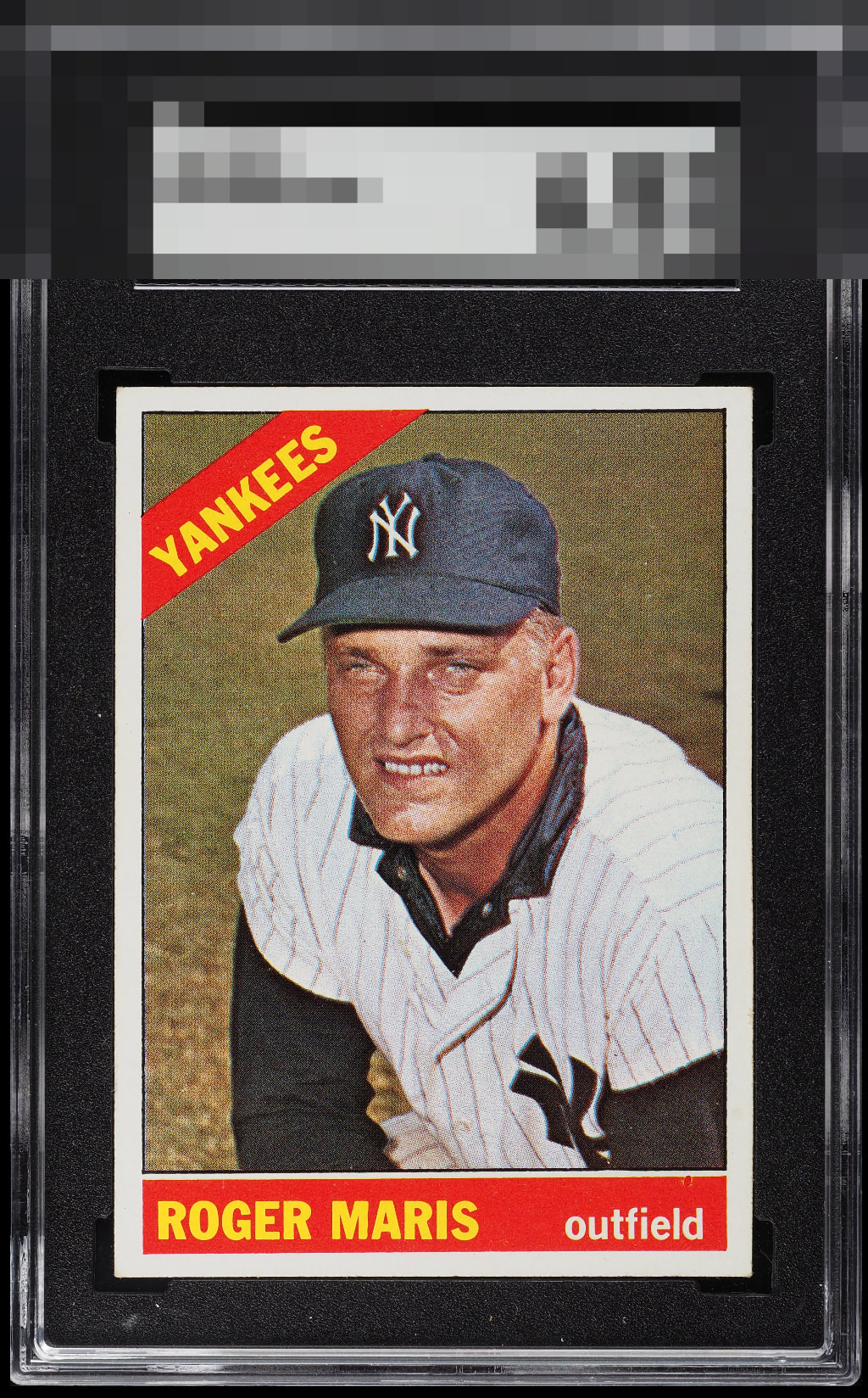
1966 Topps Roger Maris #365

Reviews & Discussions
12 total reviews


Back is off center a bit and there’s a handful of fisheyes on the card. Everything else is too good to pass up. It’s a beauty.


Very hard to find a copy this clean and well centered. A very subtle tilt holds it back from GT.


It took me a while to find something I could possibly nitpick, which means whatever that is, it does not affect the eye appeal. GT it is.


I really don't see what I would want to upgrade on this card. Nothing grabs my eye in a negative way here. A card like this really shows collectors how the grading companies have brainwashed too many of us into spending more than we need to be fully satisfied.

Amazing Card and Great to look at Love the size of the borders and the evenness of them and the brightness. Frames the image great. The colors and image are amazing. Minor surface issue in the Red above the word outfield but luckily it blends in real well unless you look really close
EyeQ+
EYEQ+ TROPHY CASE


Rating Distribution
12 total reviews
Very clean card with a great image. Slight tilt and a print defects in the lower right keep this just below god tier for me.