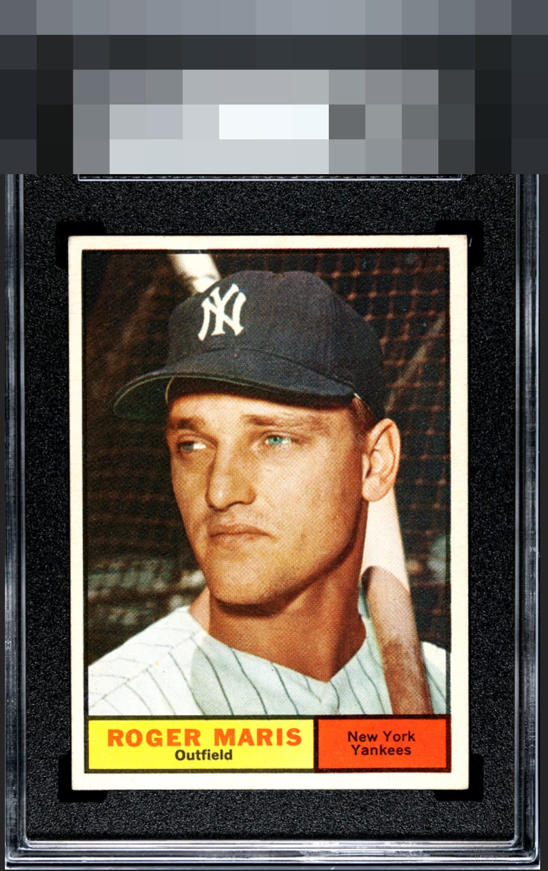
1961 Topps Roger Maris #2
Reviews & Discussions
8 total reviews


Love how strong and deep the colors and color contrast are. The centering holds it back from Top Tier

Cracks into my top tier solidly. Love the PD-free yellow and red panels. Image is great with no visual noise in the black background. Centering is the lone flaw.

Minor shift is first noticed, honest corner wear but image and print is excellent. A very high eye appeal example.


One of my favorite sets because most of the cards are clear portraits of the players. Very plain style, but I like the simplicity and the full stats on back. What I love about this card is it's the year before Roger's life gets turned upside down. Just a young slugger fresh off his first MVP season and what should have been a long, successful career not overshadowed by one great one. And the card has wonderful focus, bright, crisp colors framed by the perfectly white bright border. Slightly off center and some blemish top right barely make an impact for an extremely tough set to find centered and spot free.
EyeQ+
EYEQ+ TROPHY CASE


Rating Distribution
8 total reviews
Really really nice example. Centering is slightly off but I’d still love this copy.