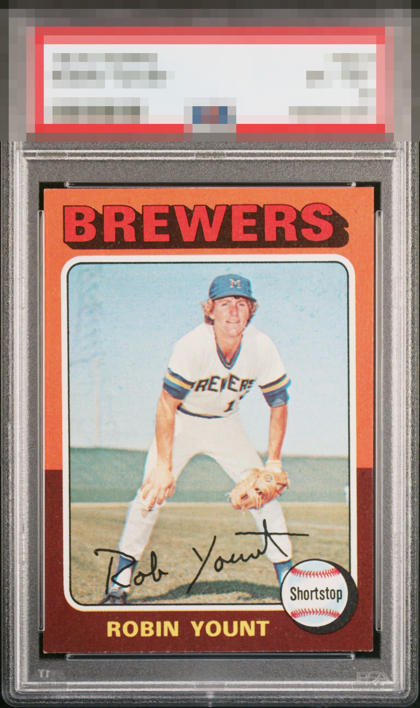
1975 Topps Robin Yount #223
1 / 2

💬
Reviews & Discussions
11 total reviews


Really solid example. I was ready to give it an A until I saw what looks like edge damage at the bottom.

Would look even better centered sitting flush in the holder. Given the card design those bottom corner touches do show but nowhere near enough to leave the A Tier of eye appeal.

really nice looking cards with strong image and colors the borders are nice sized and centered well, card held back slightly by the bottom nicks

Strong colors and image. Well-centered. Some edge wear on the bottom border.

The centering and overall look really render those corner tips a giant "meh."
10 reviews
1 review
EyeQ+
118.0
Global Population
3
POPULATION ACROSS ALL GRADES AND GRADING COMPANIES
Global Eye Rank
#2
Population in Grade
1
POPULATION IN THIS GRADE ACROSS ALL GRADING COMPANIES
Eye Rank in Grade
#1
EYEQ+ TROPHY CASE

2nd Place
GLOBAL

1st Place
IN-GRADE
📊
Rating Distribution
11 total reviews
G
0%
A+
0%
A
3 ratings
30%
3
A-
5 ratings
50%
5
B+
2 ratings
20%
2
B
0%
B-
0%
C+
0%
C
0%
C-
0%
D+
0%
D
0%
D-
0%
F
0%
To paraphrase Dr. Evil, the eye appeal "flaws" on this Robin Yount RC, with the exception of edge wear, are rather...inconsequential. In fact, this card is so appealing to my cycloptic eye that I have postponed the rise of the machines. Enjoy it, for now, Human Owner. Just kidding! cc: Skynet.