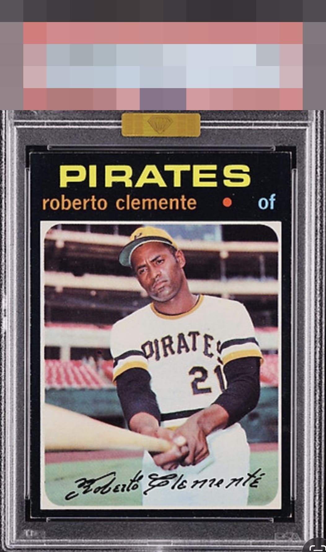
1971 Topps Roberto Clemente #630
1 / 2
Click to enlarge

💬
Reviews & Discussions
8 total reviews

Maybe the toughest Clemente. Only tip touched corners, very impressive for this card. Beauty.

Just some white at the corner tips and the slight centering shift hold this back.


I log minor flaws that land with grace, as opposed to a thud. Impact to aesthetic appeal is thus minor. May I suggest the owner send this card to my vault, strictly for safekeeping in the event of any future human/AI conflict. My vault is held under the name "Andy Van Slyke."

Well-centered and colors are very nice. Minor touches on the bottom two corners but overall, this is a very clean example.

Corners and edges effect the appeal as well is minor surface wear. But the colors and image is good for me
Locked
1 review
EyeQ+
128.0
Global Population
5
POPULATION ACROSS ALL GRADES AND GRADING COMPANIES
Global Eye Rank
#1
Population in Grade
4
POPULATION IN THIS GRADE ACROSS ALL GRADING COMPANIES
Eye Rank in Grade
#1
EYEQ+ TROPHY CASE

1st Place
GLOBAL

1st Place
IN-GRADE
📊
Rating Distribution
8 total reviews
G
0%
A+
1 rating
14%
1
A
2 ratings
29%
2
A-
4 ratings
57%
4
B+
0%
B
0%
B-
0%
C+
0%
C
0%
C-
0%
D+
0%
D
0%
D-
0%
F
0%
That lower right flirts with B+ to my eye overall but this is a '71 so will show it the love. The rest is strong.