1956 Topps Roberto Clemente #33

Reviews & Discussions
11 total reviews

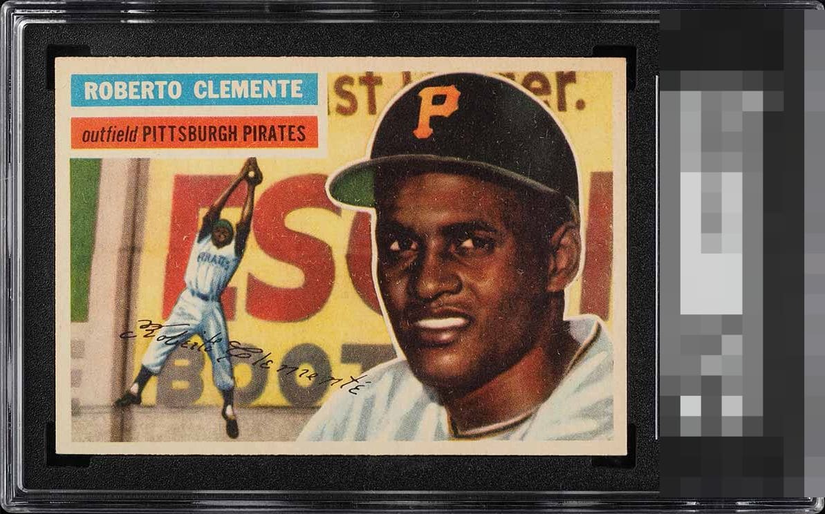
Snow and tilt bring this to a B. Corners look fairly sharp, I could see this being graded higher by someone more into “Pack Fresh”

Deserving of PWCC sticker. Super sharp. Slight OC/tilt doesn't bother my eye, but there's also some light snow throughout.

Print fuzz is the only real hit to eye appeal for me. Centering and corners are sublime.

Definitely top tier, just hard for me to decide how much the surface snow would be noticed in person. Great looking card.

The first thing I notice is the snow around his face and hat, along with a slight tilt. Even with that, the overall presentation still feels quite nice to me.

15% my a$$. This card hits my eye more like top .001% for its grade. We'll see where it ranks among all 5.5s in all grading companies when all is said and done. For now, while I see the sort of speckling in the image, its generalized across the card and so it is easy for me to ignore. What I cannot ignore is the near dead on centering (mild tilt) and how sharp it looks overall. That word is really key with eye appeal: overall. This card just has 'it' to my eye.


This card is all that. It has the nice centering and the image is strong and some nice coloring. The card has yellowed a bit with age
EyeQ+
EYEQ+ TROPHY CASE


Rating Distribution
11 total reviews
A pleasing copy worthy of the highest tier designation. I detect print "static" that creates a modicum of visual friction. However, the other attributes of this specimen are of the highest caliber. The result is A- eye appeal.