1955 Topps Roberto Clemente #33

Reviews & Discussions
11 total reviews

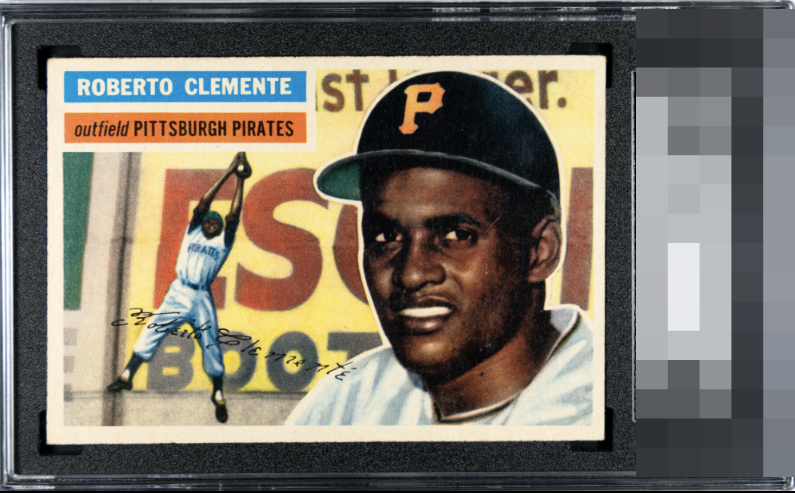
This is a powerful Clemente. Bold color. Sharp registration. Portrait image with the best of tones. Hold backs are a slight right centering and a top left corner that wears differently than the rest. The nameplate here is one of the best you'll find

Just makes the Top Tier. Centering is the one aspect that impacts eye appeal.


Nice card, just a bit stronger centering and slightly better focus/surface and this would be firmly in the A tier for me.

Centering is my only issue here yet merits a high eye appeal badge of B+ to me.

Like the overall appearance of the card. The borders are nice size but off center. The borders could be brighter(as you go left to right and bottom to top the borders seem to become discolored and less bright. The overall image is strong and the colors are good but do not POP

Centering off slightly left to right, but this is a card. Very clean and the main image really pops.

Centering is the lone detracting factor on this card, for my eye-- and that is to a mild degree. Corners have retained their shape, surface hits my eye great, really solid, pretty example of my favorite Clemente besides the 1972 Topps.
EyeQ+
EYEQ+ TROPHY CASE


Rating Distribution
11 total reviews
Love this 56 Clemente. Bob has it all going for him here - centering being the lone place we’re improvement might be justified. Surface, print and corners all look strong - congrats on an A tier card.