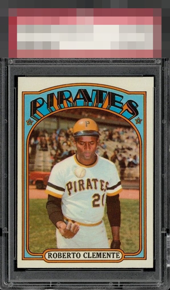
1972 Topps Roberto Clemente #309
1 / 2
💬
Reviews & Discussions
5 total reviews

Centering is the only obvious flaw, yet it stands out on this particular card/design.

Oh SO SO Close Love the overall look and so much to like about it But the centering is just off by more than I like and it holds it back from true Greatness BUT it is a Card for anyone to feel really good having
3 reviews
2 reviews
EyeQ+
--
Global Population
3
POPULATION ACROSS ALL GRADES AND GRADING COMPANIES
Global Eye Rank
—
No Eye Q+ score
Population in Grade
1
POPULATION IN THIS GRADE ACROSS ALL GRADING COMPANIES
Eye Rank in Grade
—
No Eye Q+ score
EYEQ+ TROPHY CASE

GLOBAL

IN-GRADE
Trophies appear here when earned.
📊
Rating Distribution
5 total reviews
G
0%
A+
0%
A
1 rating
33%
1
A-
0%
B+
0%
B
1 rating
33%
1
B-
1 rating
33%
1
C+
0%
C
0%
C-
0%
D+
0%
D
0%
D-
0%
F
0%
Clean card with nice color. Left to right centering holds it back though.