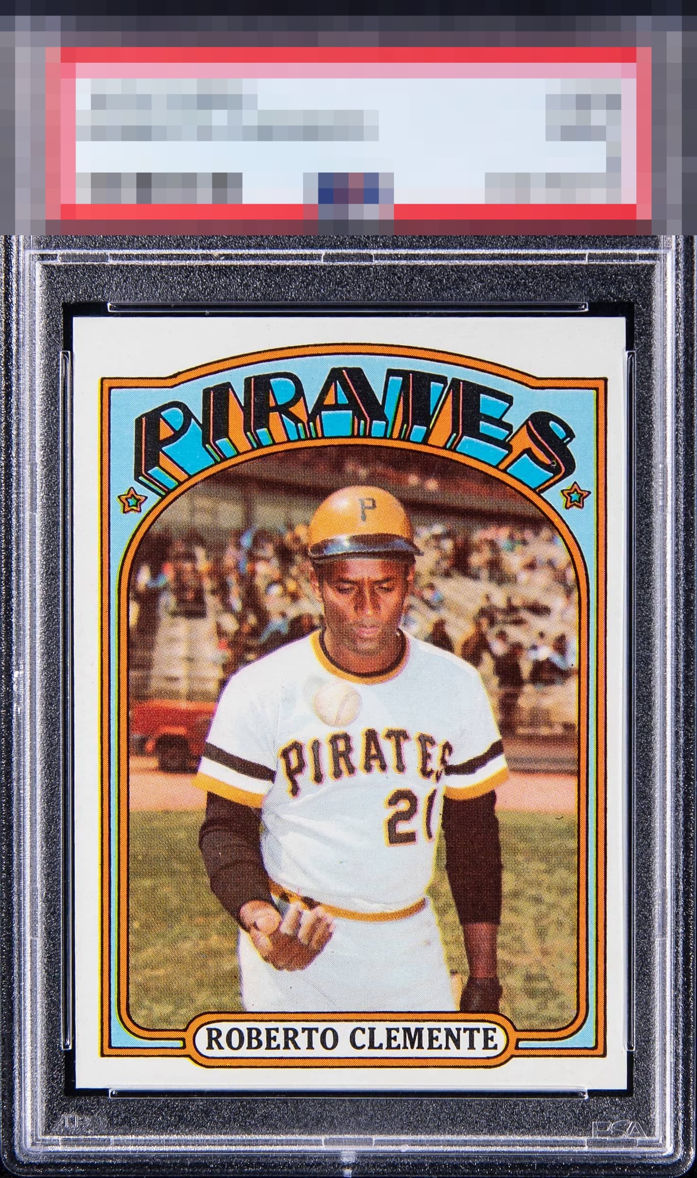
1972 Topps Roberto Clemente #309
1 / 2
💬
Reviews & Discussions
4 total reviews

That centering really caps it, for my taste. It is listing to the right like it clipped an iceberg.

Great Looking Card. Colors and Image are all really solid. The borders are clean, bold and bright (slight off center if you really look)
3 reviews
1 review
EyeQ+
--
Global Population
3
POPULATION ACROSS ALL GRADES AND GRADING COMPANIES
Global Eye Rank
—
No Eye Q+ score
Population in Grade
2
POPULATION IN THIS GRADE ACROSS ALL GRADING COMPANIES
Eye Rank in Grade
—
No Eye Q+ score
EYEQ+ TROPHY CASE

GLOBAL

IN-GRADE
Trophies appear here when earned.
📊
Rating Distribution
4 total reviews
G
0%
A+
2 ratings
67%
2
A
0%
A-
1 rating
33%
1
B+
0%
B
0%
B-
0%
C+
0%
C
0%
C-
0%
D+
0%
D
0%
D-
0%
F
0%
Color leaps off the card, particularly in the Pirates zone… where the orange and blue stay richly saturated in a way most 1972s rarely hold. Roberto’s portrait lands with virtually flawless registration, giving the face and batting helmet lines a confident crispness. Corners are excellent, edges read strong, and the surface remains calm. Off centering is the lone restraint and it barely registers against the overall presentation. A high A range example with genuinely elevated eye appeal.