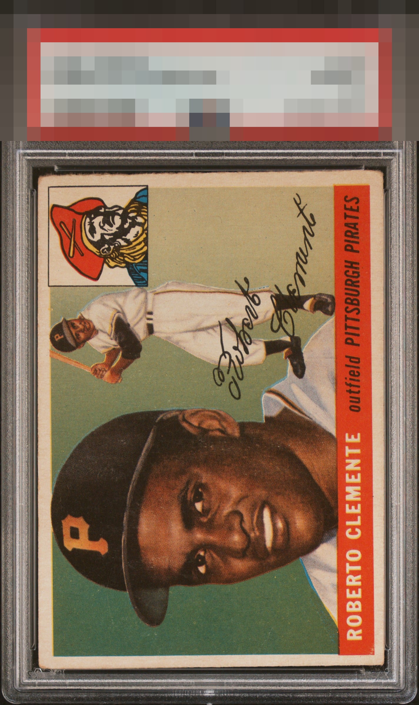
1955 Topps Roberto Clemente #164

Reviews & Discussions
13 total reviews

Tilt and the top edge distract a bit from what is a strong image without major blemishes.

Really great color and lack of any major blemishes is a plus, but the tilt, corner wear and slight focus issue holds it back from a higher grade for me.

Slight tilt and some surface issues bit overall well presenting. I love the rough cut.

Surface wear and confusing centering throws me off this copy.

Some tilt but centered better than most. Color looks a little faded, still presents well.

Paging Lord Slabington! This is the kind of Roberto I hope to find someday. Mild centering and slant cut to the rough cut edge is all I would cite.


the first thing I see is the slant/off center of the card(especially seen in the right side of the card to the top right). The image itself is strong. The colors are not as sharp as I would like
EyeQ+
EYEQ+ TROPHY CASE

Rating Distribution
13 total reviews
A solid B with centering the only drawback.