1955 Topps Roberto Clemente #164

Reviews & Discussions
14 total reviews


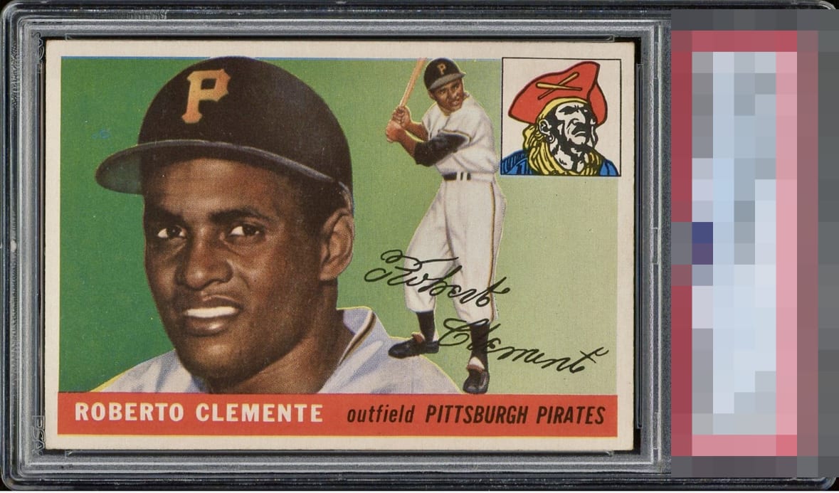
Tremendous 5. Elite centering aside from a slight tilt. One noticeable blue defect to the left of hat. Technically under graded at first look, and post review

The centering is, quite simply, excellent, lending the card a balanced and visually appealing composition. The red lower half, which highlights the player's name and team, is vivid and free from the common imperfections that often plague this set. Notably, the team logo in the upper right corner is impressively well-aligned—a rarity that sets this card apart from its peers. The green background remains largely unblemished by roller marks or chipping, preserving the card’s crisp and vibrant aesthetic. In terms of imagery, the player's portrait is sharp and well-defined, contributing to the overall top-tier A presentation.

Top notch centering and just a little bit of surface wear. Gorgeous example that looks leaps and bounds nicer than the technical grade. Bravo to the owner.


Nice looking card. No obvious distractions. The card is nice looking but does not POP.

As notorious as any card in terms of centering, and this one is nearly perfect. Would not look out of place in a 7 holder, either. Prime example of where sheer looks don't harmonize with the third party opinion. Superb example that is a treat to stare at.
EyeQ+
EYEQ+ TROPHY CASE


Rating Distribution
14 total reviews
Amazing example. I had to zoom in to notice the blue print dot on the top left corner. Centering is nearly 50/50.