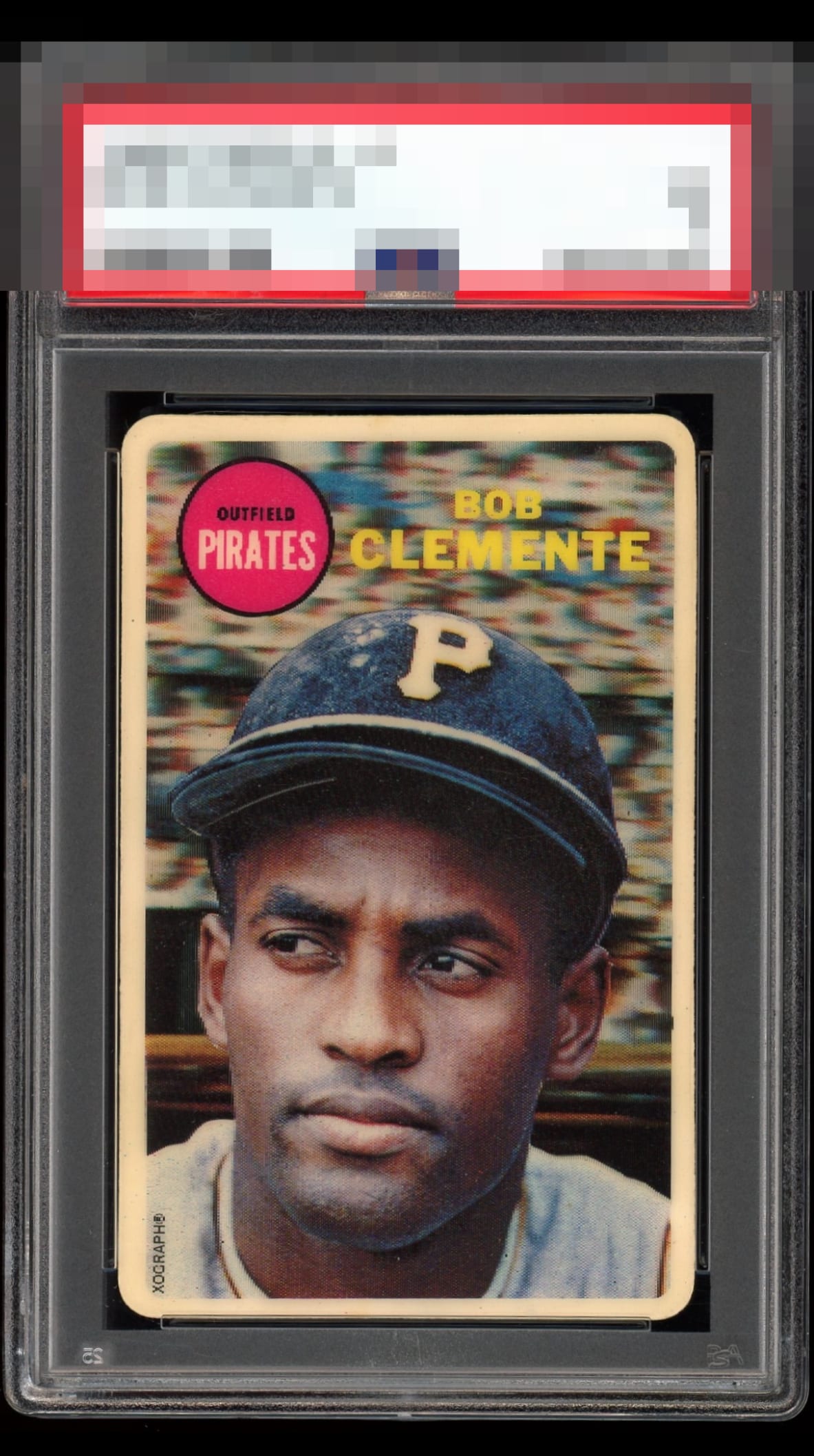
1968 Topps Roberto Clemente #0

Reviews & Discussions
12 total reviews


The design of this card is such that I don't stress the centering as much as usual. The large portrait image and funky background hold the attention and there's really nothing at all besides centering to cite.

Beautiful card, centering is the only item taking it out of god tier. Great find.

Super cool card. Not too familiar with it but not sure how it could look much better aside from centering being a tick off.

Insanely epic card here! Only thing keeping it from God Tier is the centering, which is still pretty good, just not perfect.


Stunning example that looks as good as any example I’ve ever seen. Kudos to the owner. Beautiful card!


like the look of the front and amazed the back is both so clean and so bright. The front looks good and the image is sharp and the borders are balanced
EyeQ+
EYEQ+ TROPHY CASE


Rating Distribution
12 total reviews
Centering is all I think could be upgraded.