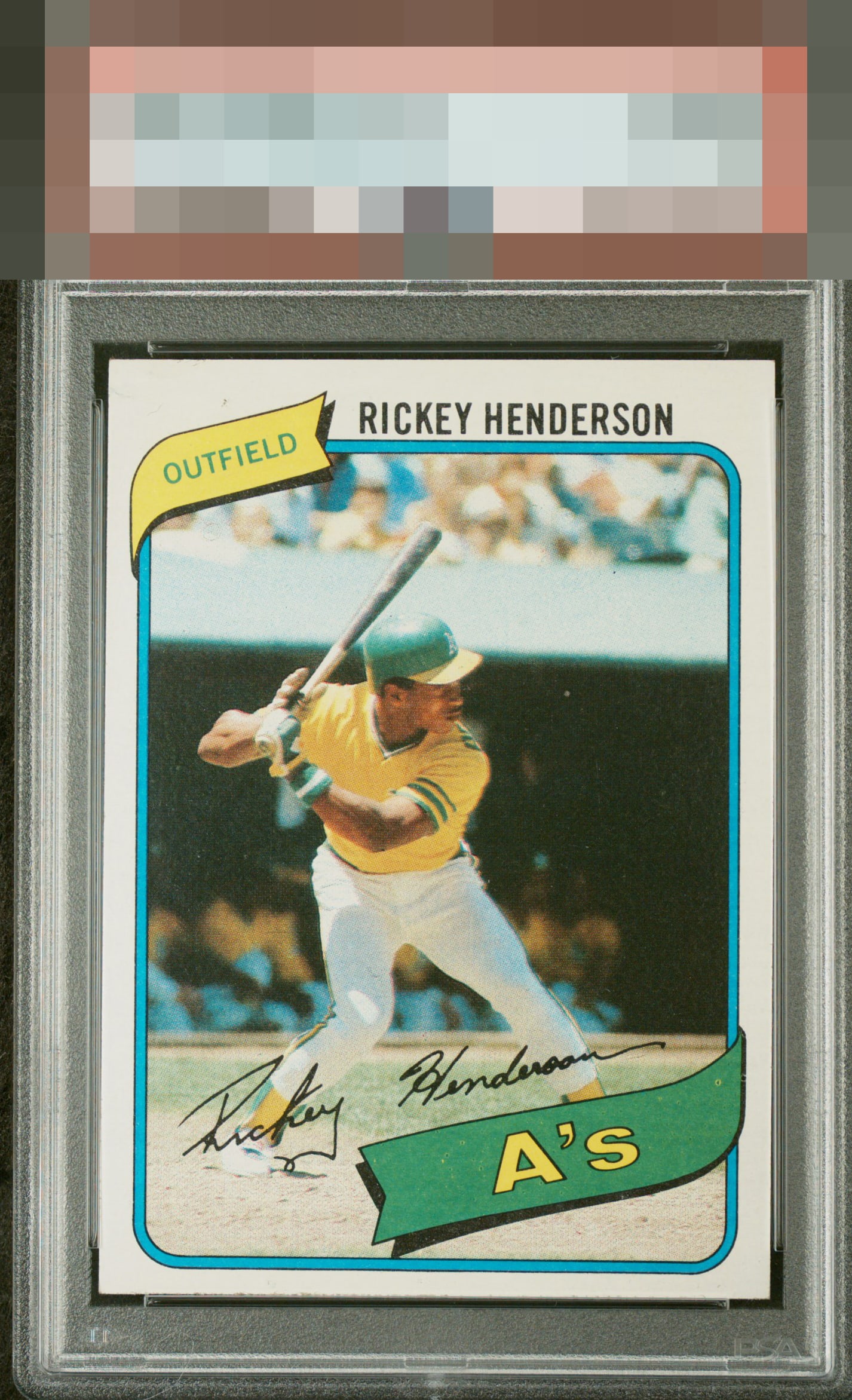
1980 Topps Rickey Henderson #482
1 / 2
Click to enlarge
💬
Reviews & Discussions
5 total reviews


Centered low is the main issue for me, then there's just one fish eye in the team's green banner.

Very good eye appeal with some PD in the banner and low centering being the aspects that impact.

4 of 7 reviews
1 review
EyeQ+
--
Global Population
11
POPULATION ACROSS ALL GRADES AND GRADING COMPANIES
Global Eye Rank
—
No Eye Q+ score
Population in Grade
3
POPULATION IN THIS GRADE ACROSS ALL GRADING COMPANIES
Eye Rank in Grade
—
No Eye Q+ score
EYEQ+ TROPHY CASE

GLOBAL

IN-GRADE
Trophies appear here when earned.
📊
Rating Distribution
5 total reviews
G
0%
A+
0%
A
0%
A-
2 ratings
50%
2
B+
1 rating
25%
1
B
1 rating
25%
1
B-
0%
C+
0%
C
0%
C-
0%
D+
0%
D
0%
D-
0%
F
0%
nice card and would be proud to own. T/B centering seams a little low making card look tilted