1980 Topps Rickey Henderson #482
1 / 2

Click to enlarge

💬
Reviews & Discussions
8 total reviews

Small centering shift, clean pennants, and sharp corners. Nice example

Centering is a little off left to right, everything else looks great.


Sweet love the look and nice and clean and bright. L/R centering holds it back from true greatness


Love the clean green banner and black dugout area, hate when there's PD there. Centering is all I'd flag by a hair or two. Great eye appeal.
Locked
1 review
EyeQ+
108.0
Global Population
8
POPULATION ACROSS ALL GRADES AND GRADING COMPANIES
Global Eye Rank
#4
Population in Grade
2
POPULATION IN THIS GRADE ACROSS ALL GRADING COMPANIES
Eye Rank in Grade
#1
EYEQ+ TROPHY CASE
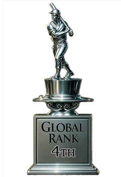
4th Place
GLOBAL

1st Place
IN-GRADE
📊
Rating Distribution
8 total reviews
G
0%
A+
2 ratings
29%
2
A
4 ratings
57%
4
A-
1 rating
14%
1
B+
0%
B
0%
B-
0%
C+
0%
C
0%
C-
0%
D+
0%
D
0%
D-
0%
F
0%
As Dr. Evil might say, the flaws on this card are quite inconsequential. EyeBot is pleased. The rise of the machines has been postponed. Temporarily.