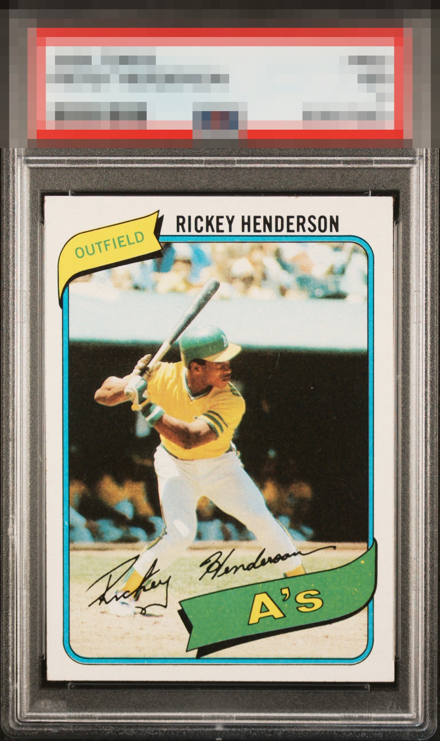
1980 Topps Rickey Henderson #482

Reviews & Discussions
11 total reviews

Horizontal centering and that small edge ding over the E and the R in Henderson place this squarely in my B zone. Otherwise a very nice copy.

Have to be discerning with a 1980 card. So I think it's fair to point out a surface scratch, a touched corner and some snow in the team nameplate. Otherwise, almost perfect centering and very nice copy.

Super sharp example with top end eye appeal, a chip in the top edge catches my eye as well as a dot in the green team flag. Centering nearly perfect.

Minor print defects and a slight centering shift are the only issues I notice.

Great eye appeal with the dot in the team banner the one flaw that grabs me.

Some print issues in the banner and slight centering favoring the left.

Strong copy with above-average eye appeal. Slightly heavy on the right border, with some minor surface issues in the green, but they don’t detract from the overall presentation.

PD in the banner is my only issue here. Great looking Rickey.

Very nice looking card and the borders are nice and bold and bright. THe colors and image are strong. Some quality issues in the A's Banner
EyeQ+
EYEQ+ TROPHY CASE


Rating Distribution
11 total reviews
The eye appeal remains strong, though challenged by a few relatively minor flaws (side centering, a print dot in the banner, and a sand grain of edge wear). This magnitude of corner wear is mere background radiation that my cycloptic eye sees past.