1980 Topps Rickey Henderson #482

Reviews & Discussions
12 total reviews

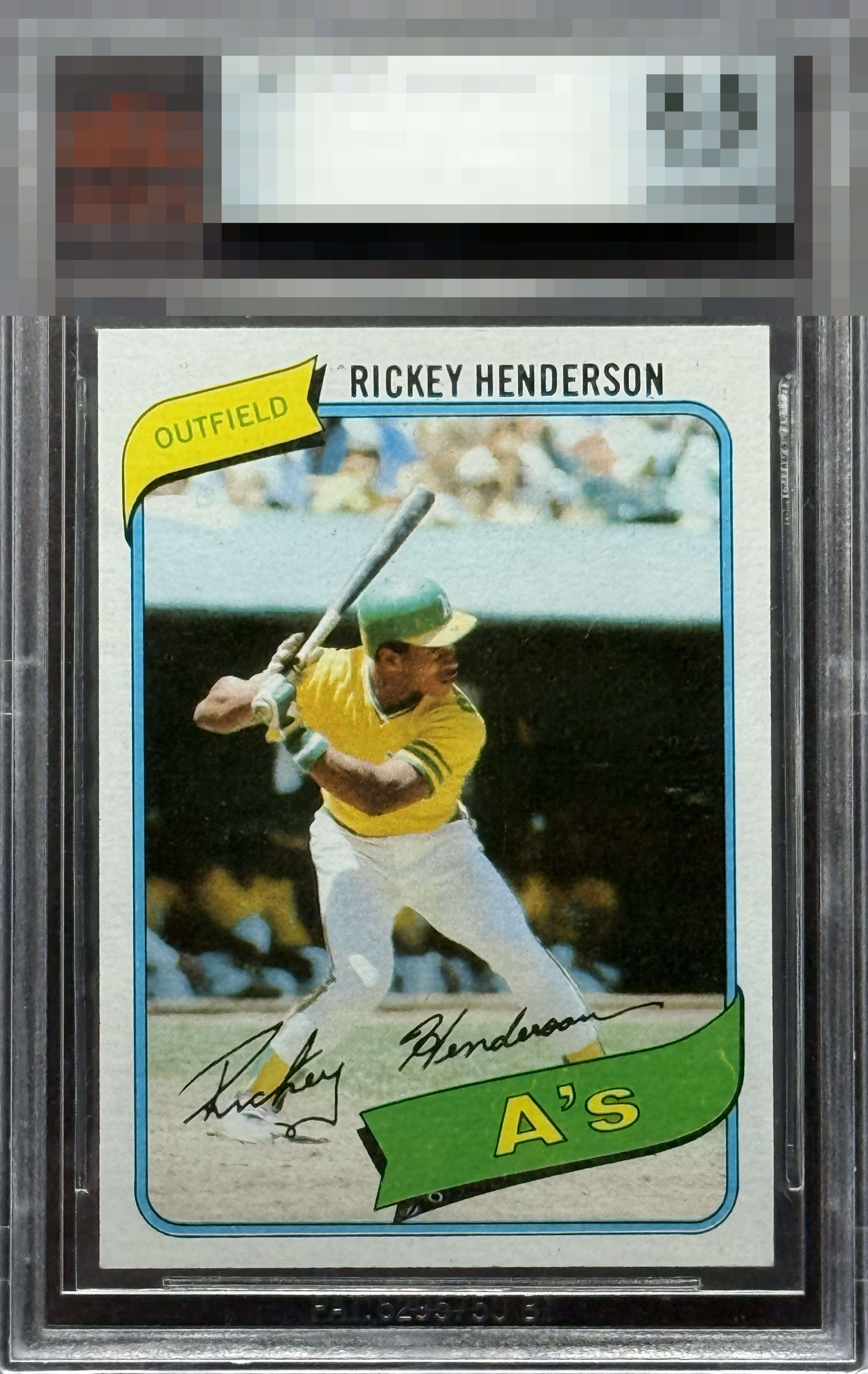
Centering and overall sharpness keep the eye appeal in the top level despite a fish eye that does leap out.

A well centered copy. Something about the image just doesn’t pop, keeping it from A tier.

Eliete centering. Sharp corners. Fish eye and white mark in the A's banner and a couple black specks by his name keep it from GT status, for me.

Solid copy with some minor print dots and centering/tilt issues that are common for this card.

Take away the print dot under the banner and this vaults into an A badge. Great looking example of a real iconic card.

Really strong example of one of the best cards from the 80s. Centering looks above average to me, and overall eye appeal is solid. Just a few surface issues/fish eyes which hold it back slightly for me.

Centering is lights out. PD under the banner does get me a little.


clean card with nice colors and images but the card does not POP and there are some surface blemishes, minimal but there. Overall Strong
EyeQ+
EYEQ+ TROPHY CASE


Rating Distribution
12 total reviews
High eye appeal. For me, just that print dot in the banner really draws attention. Not enough to leave the top tier of eye appeal, though!