1952 Topps Richie Ashburn #216
1 / 2
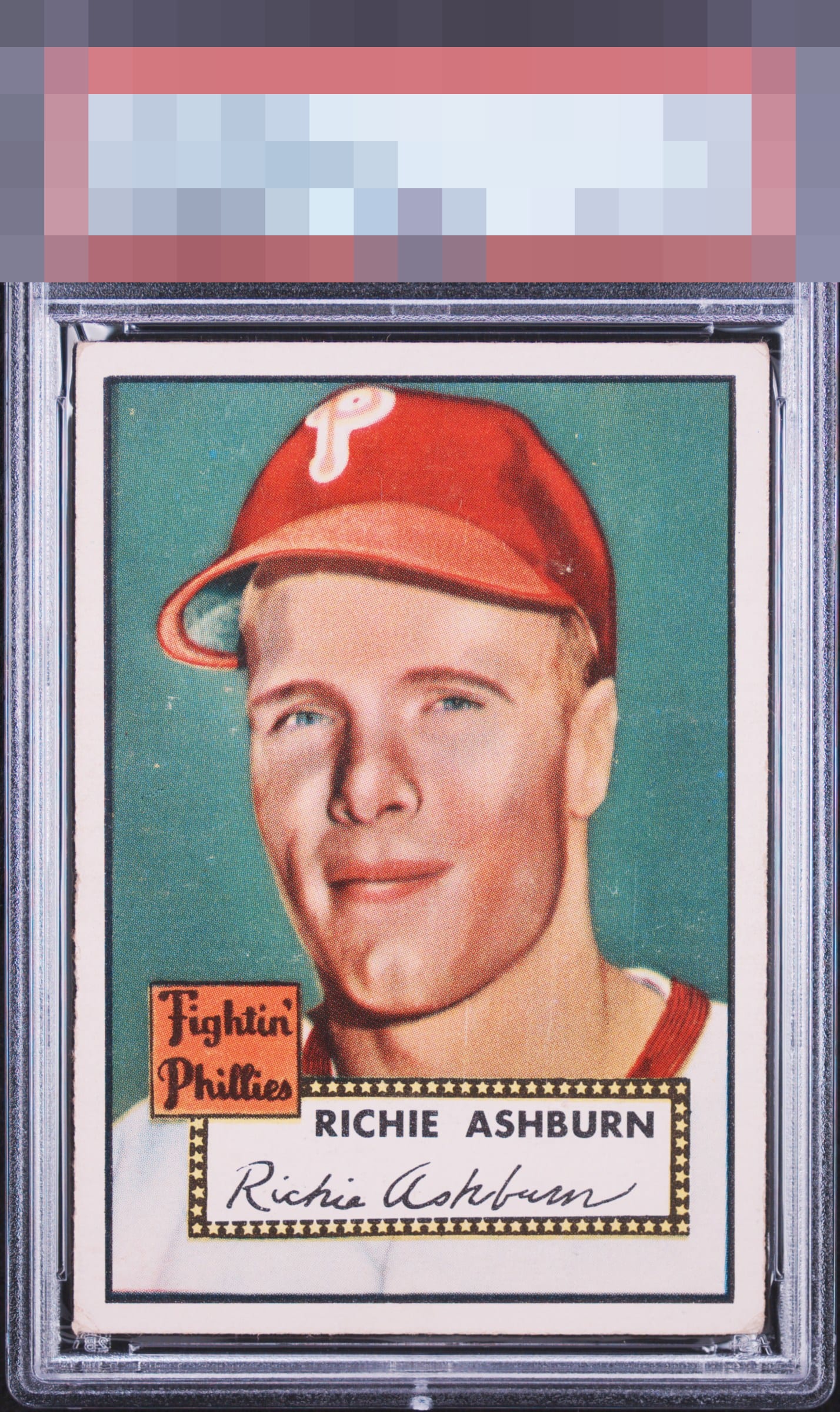
Click to enlarge

💬
Reviews & Discussions
4 total reviews

For my taste, it's centering for the win here. The background noise does impact visual appeal, but the framing and absence of loud flaws whisks this one past the velvet rope.

nice and bright with good colors. Centering is respectable but surface effects the image and overall appeal

3 of 7 reviews
1 review
EyeQ+
--
Global Population
3
POPULATION ACROSS ALL GRADES AND GRADING COMPANIES
Global Eye Rank
—
No Eye Q+ score
Population in Grade
2
POPULATION IN THIS GRADE ACROSS ALL GRADING COMPANIES
Eye Rank in Grade
—
No Eye Q+ score
EYEQ+ TROPHY CASE

GLOBAL

IN-GRADE
Trophies appear here when earned.
📊
Rating Distribution
4 total reviews
G
0%
A+
0%
A
0%
A-
1 rating
33%
1
B+
1 rating
33%
1
B
1 rating
33%
1
B-
0%
C+
0%
C
0%
C-
0%
D+
0%
D
0%
D-
0%
F
0%
Image looks very nice but has some surface wear scattered in the background.