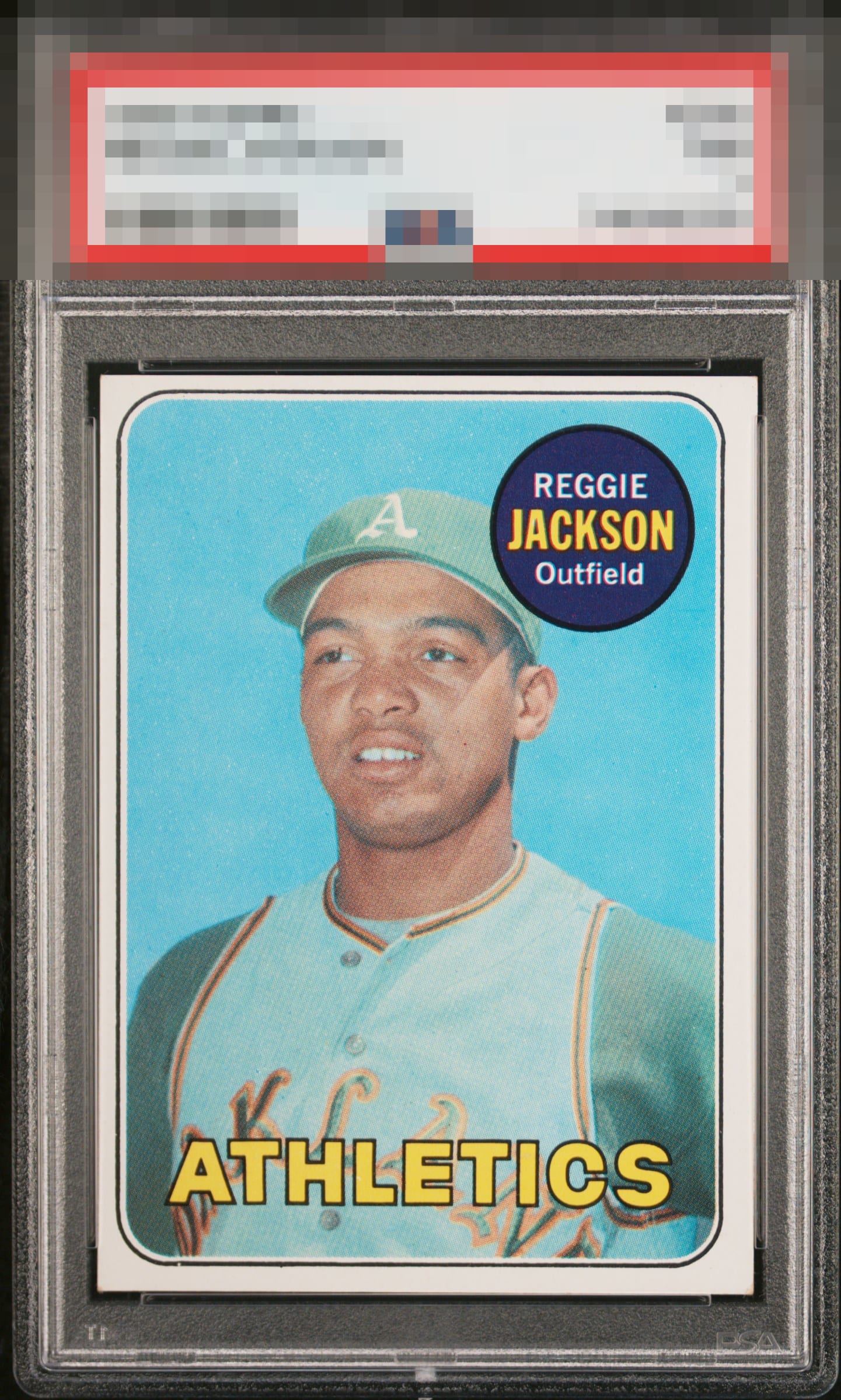
1969 Topps Reggie Jackson #260

Reviews & Discussions
10 total reviews

Solid Jackson. The centering is the biggest drawback which is more important for a portrait card. The name circle is a little fuzzy. The strengths are the solid blue, blemish free image. The clean look and sharp corners are also real merits

This card survives my cycloptic scan with its dignity intact. A centering shift creates visual friction, yet not enough to dislodge eye appeal from the B Tier. Other aspects of this card reach or exceed the A-Badge threshold.


If not for centering this has top tier eye appeal to me. Solid second tier eye appeal thanks to sharpness and such a clean name circle.

The main image and color look good, but the centering is too far off for me.

Nice card and clean card. Not for me as the Borders do not POP with a crisp brightness and the off center of them

Very nice image with minor snow in the background. Centering is the main issue.
EyeQ+
EYEQ+ TROPHY CASE


Rating Distribution
10 total reviews
Good eye appeal. Everything is "A" about this card except for centering.