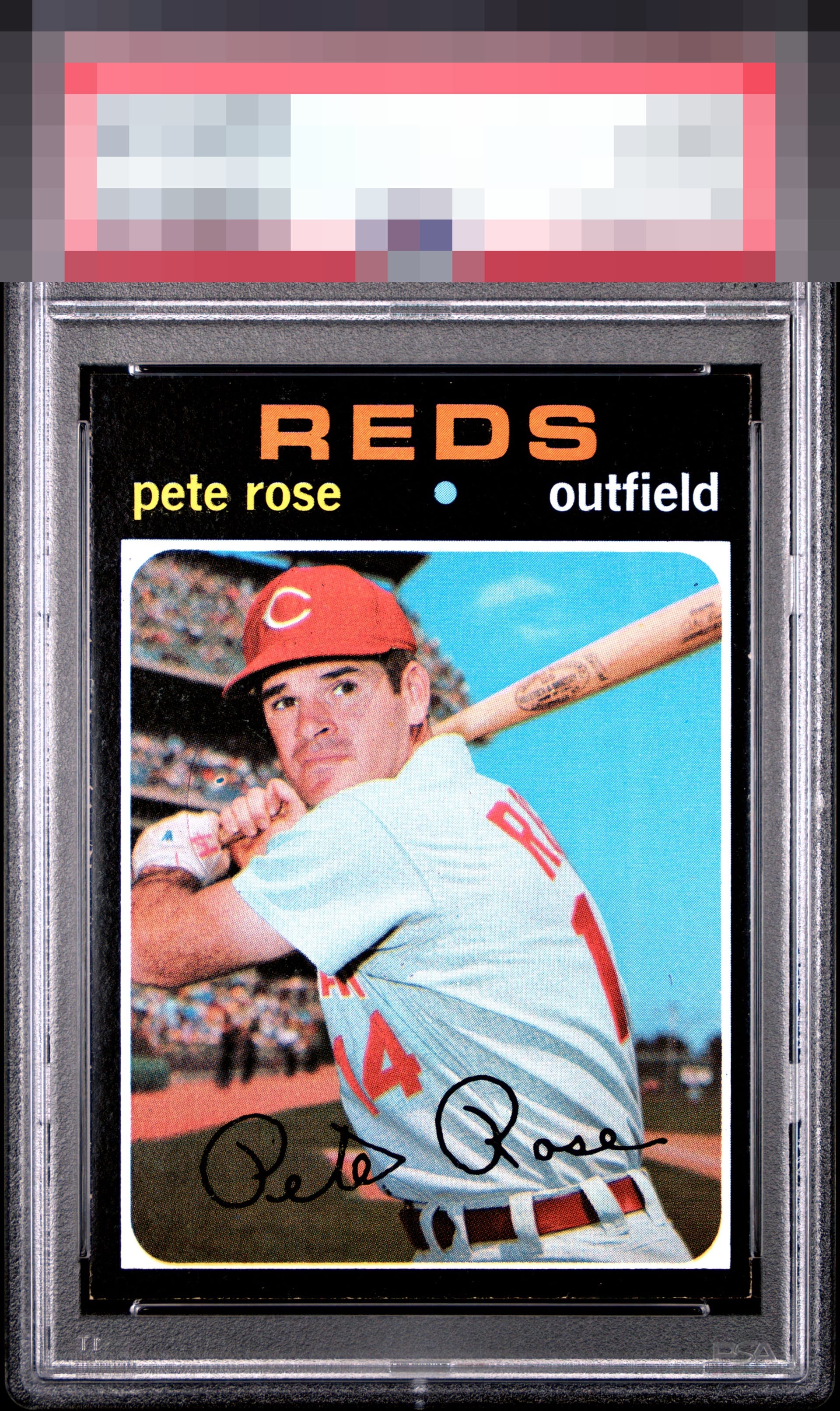
1971 Topps Pete Rose #100
1 / 2
Click to enlarge
💬
Reviews & Discussions
8 total reviews

Centering and one PD above his hands that draws my attention are the flaws I would flag. The overall look is still very good.

Great color. Pete looks focused. Centering and edges have issues.

Edge funk and centering are the main issues. Good color and sharpness.

Very good overall looks with centering and one print dot making some impact to my eye.


nice mid tier card with a little more border wear than i would like and off centering
Locked
1 review
EyeQ+
109.0
Global Population
1
POPULATION ACROSS ALL GRADES AND GRADING COMPANIES
Global Eye Rank
#1
Population in Grade
1
POPULATION IN THIS GRADE AND GRADING COMPANY
Eye Rank in Grade
#1
EYEQ+ TROPHY CASE
1st Place
GLOBAL

1st Place
IN-GRADE
📊
Rating Distribution
8 total reviews
G
0%
A+
0%
A
0%
A-
2 ratings
29%
2
B+
3 ratings
43%
3
B
2 ratings
29%
2
B-
0%
C+
0%
C
0%
C-
0%
D+
0%
D
0%
D-
0%
F
0%
Better than most copies but the PD is what draws it down