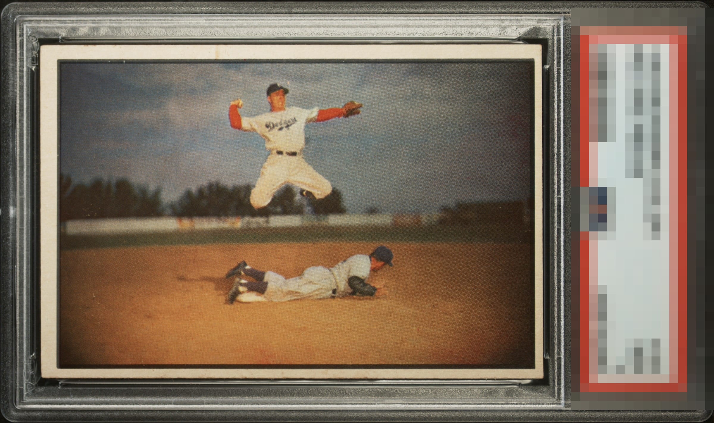
1953 Bowman Pee Wee Reese #33
Reviews & Discussions
12 total reviews

Clean and sharp, but I have a very strong preference to have this artistic masterpiece of a card framed well. This one skews heavily bottom-right, which detracts.


Incredibly strong within the borders but centering too far off the mark for me.


I like this card and I want to like it more but the borders really bother me. Between it being off centering and the discoloring in multiple locations sadly my eyes cannot get past it


I want to like this more than a C+ level, as t he color is rich. I also like the darkness of that black borderline, that can hold much more white PD than we see here. I just some staining in top and bottom borders, a white dot near Pee Wee's head grabs my eye, and the centering is just too extreme.

The print registration here is excellent, and the black border holds up with surprising strength, which gives the card a crisp presence at first glance. Unfortunately, the centering is far too compromised, pulling the eye away from those strengths. Add in the noticeable discoloration along the bottom edge, and the card loses much of the refinement it could have had. All considered, this one settles at a respectable yet limited C.
EyeQ+
EYEQ+ TROPHY CASE


Rating Distribution
12 total reviews
Obviously the centering all the way around is a distraction, but the card otherwise is really nice in terms of surface and corners.