1979 Topps Ozzie Smith #116
Reviews & Discussions
7 total reviews

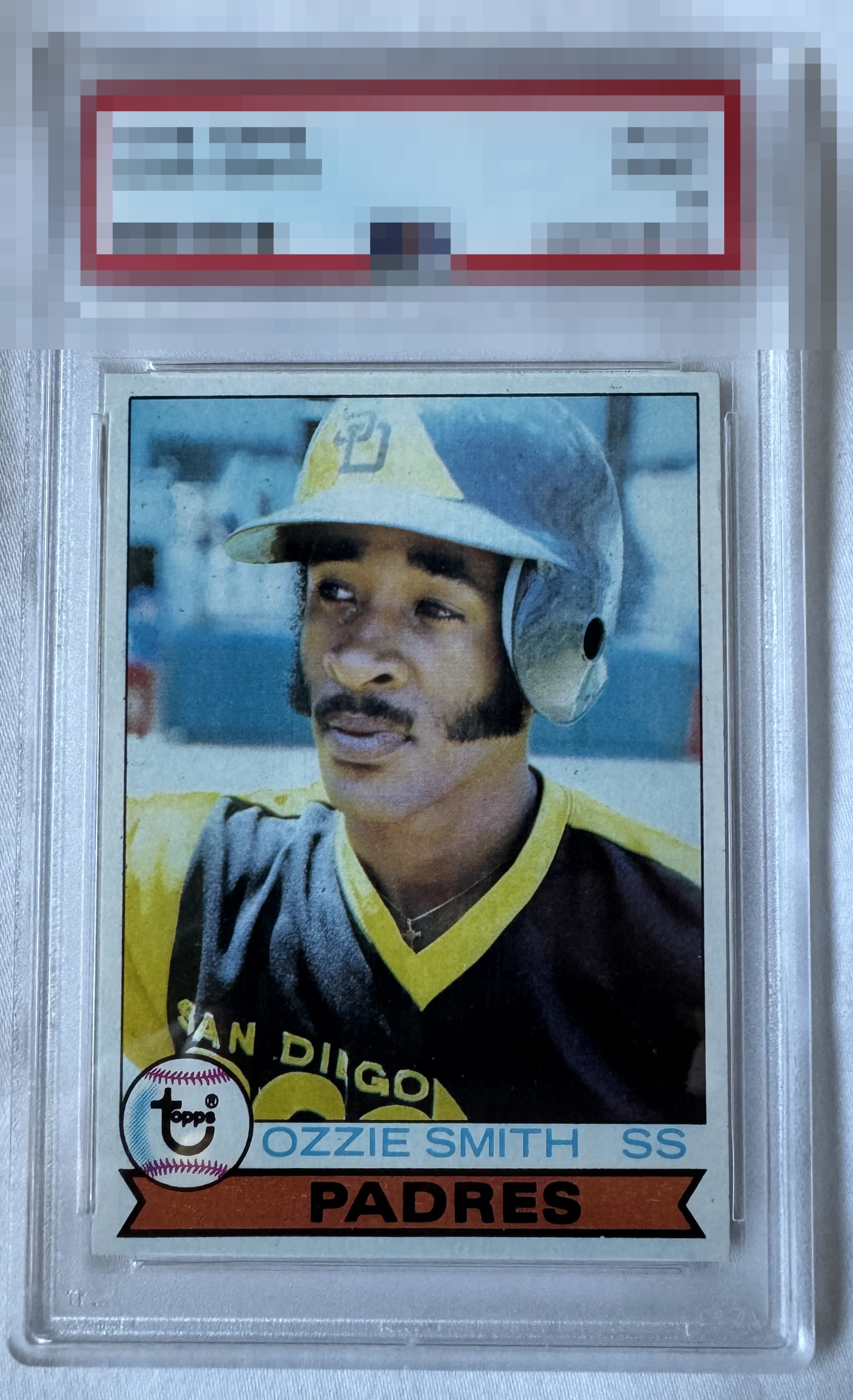
A copy with solid eye appeal, whose ceiling to me is limited by stray black print, side to side centering most visible when comparing the thickness of the side borders at their top, and what appears to be a handling depression along the upper right edge.

High eye appeal here. The black stray print is the main eye appeal flaw for me. Centering is well above average yet have on rare occasions seen a touch better in that department. Overall a strong copy deserving of a high badge.

Centered well with a slight tilt. Card is clean but there a few stray black dots that are noticeable.

High-end eye appeal for a '79 Ozzie right here; perhaps one of the most notoriously problematic cards when it comes to eye appeal, certainly of its decade. The centering on this specimen is about as good as it gets, and the image is crisply focused. Some stray black PD, mild tilt, and a right edge impression that catch my eye are the only dampening factors.

at a quick glance the centering looks good but closer you notice a tilt but only f you are looking for it. the colors and image are good but do not POP. Overall a good card that can be enjoyed just not at the highest levels


EyeQ+
EYEQ+ TROPHY CASE


Rating Distribution
7 total reviews
One of the nicer Ozzies, with high eye appeal and stray print and centering the only discernible flaws.