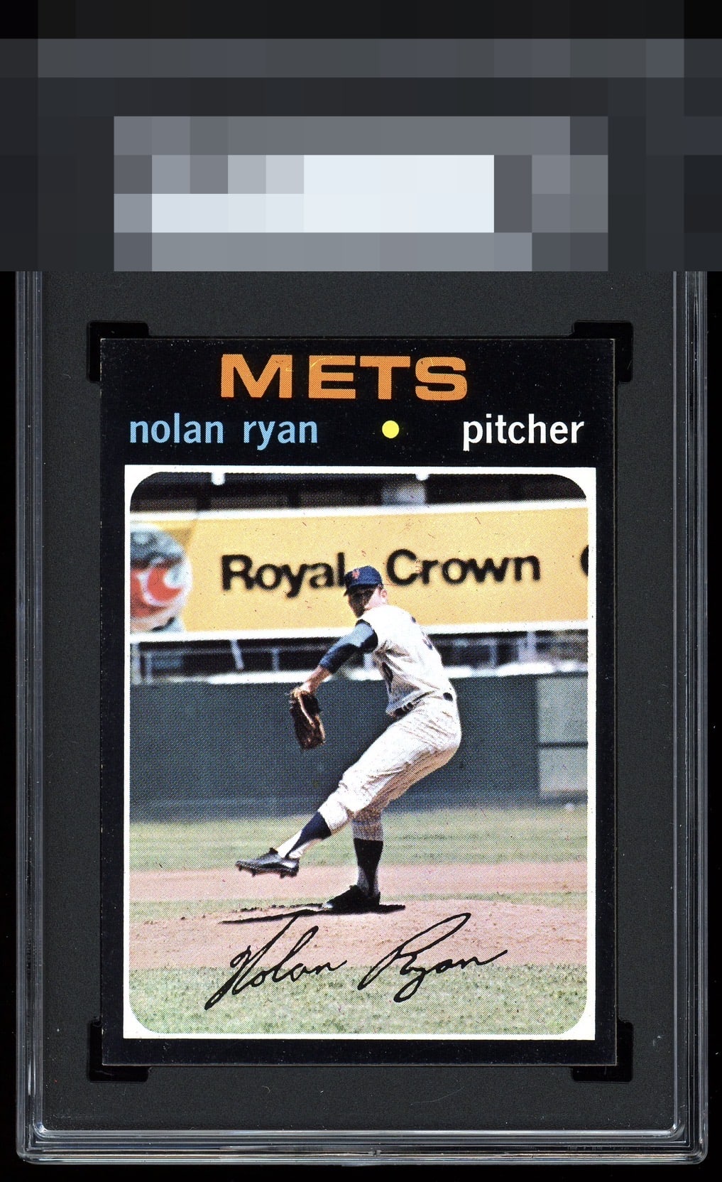
1971 Topps Nolan Ryan #513
Reviews & Discussions
12 total reviews

One of the most unforgiving sets of all time. Just a few specks of white & minor centering shift. Nice.

Centering a little high and to the right. Nice bright image, and most importantly not a whole lot of white showing on the corners and edges.

Centering is off left to right and there is some chipping on the left edge, but this is a nice example of a card that's hard to find in high grade.

That bottom edge and the corners are LIGHTS OUT for a 71. Strong example. My fave Ryan of all.

Special copy of this card. A little off centered and chipping on the left side but edges are great for a 71

An attractive 1971 Topps that outclasses the set’s unforgiving black borders. Chipping is notably sparse, and the edges and corners show uncommon polish. Horizontal centering drifts slightly while the vertical balance remains reassuring. The photo reads a touch washed, yet nothing in the frame distracts. A few tiny print bubbles touch the M in Mets, minor at normal viewing. Overall, a composed and genuinely strong example for the issue. Very nice.

Off Centered is the most I can say as the opportunity and even that is not dramatic. This is a WOW card with the colors and the image really sharp

Wow the bottom corners and edge, along with the right edge, are truly pack fresh on this 1971. That is fun to see. The centering and top left ding the eye appeal. 1971s are so tough. My favorite Ryan card.
EyeQ+
EYEQ+ TROPHY CASE


Rating Distribution
12 total reviews
A black border beauty that is a bit off in both directions.