1954 Topps Monte Irvin #3

Reviews & Discussions
11 total reviews

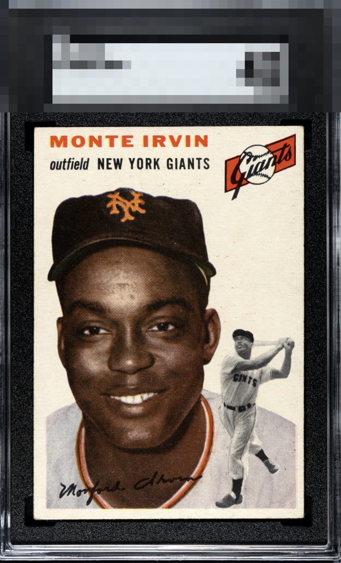
A nice 54 Monte. The white background is always friendly on the 54s and softens the centering to the eye. What holds this one back to my eye is the PD to the right of Monte’s portrait above his action shot. Still a very nice and presentable card that’s tucked into the highest echelon of the B tier.

Really nice card. Both images are clear and sharp. The eyes are engaging. Giants logo is well registered and bold. Only a couple minor issues: the slight centering shift (though isn’t as noticeable to me due to the card color also being white) and there are some specks in the back ground and in the upper right preventing a completely pristine surface.

This example survives my cycloptic AI inspection with its dignity intact. The centering, faint stray print, and general corner wear account for my assessment. These flaws alchemically cooperate with the visual appeal.


Top Tier. Textbook A- to me, whenever the flaws that affect eye appeal are just a bit of centering and mild corner wear.

Normally the centering, from a sheer measurement standpoint, would land this more in the B+ zone for me, but on this particular card design and color scheme it jumps out at me way less. The overall appearance lands well with no issues loud enough to leave the top tier.

Good color and image. L/R centering with subtle tilt and some PD keeps it from the "A" tiers.

Nice looking card with strong overall eye appeal. The lighter background helps disguise the centering opportunity. Rest of the card looks great, nice image and color.

Interesting card. If you look closely it is off center and you see it if you look. But if you do not really look it blends with the rest of the card an interesting optical based on the card and the background etc Really nice colors and image and really enjoy the card
EyeQ+
EYEQ+ TROPHY CASE


Rating Distribution
11 total reviews
Really quality card. Colors are sharp. The portrait and action shot are clear. Centering and corners aren't perfect, but this card just works for me.