1975 Topps Mike Schmidt #70

Reviews & Discussions
10 total reviews

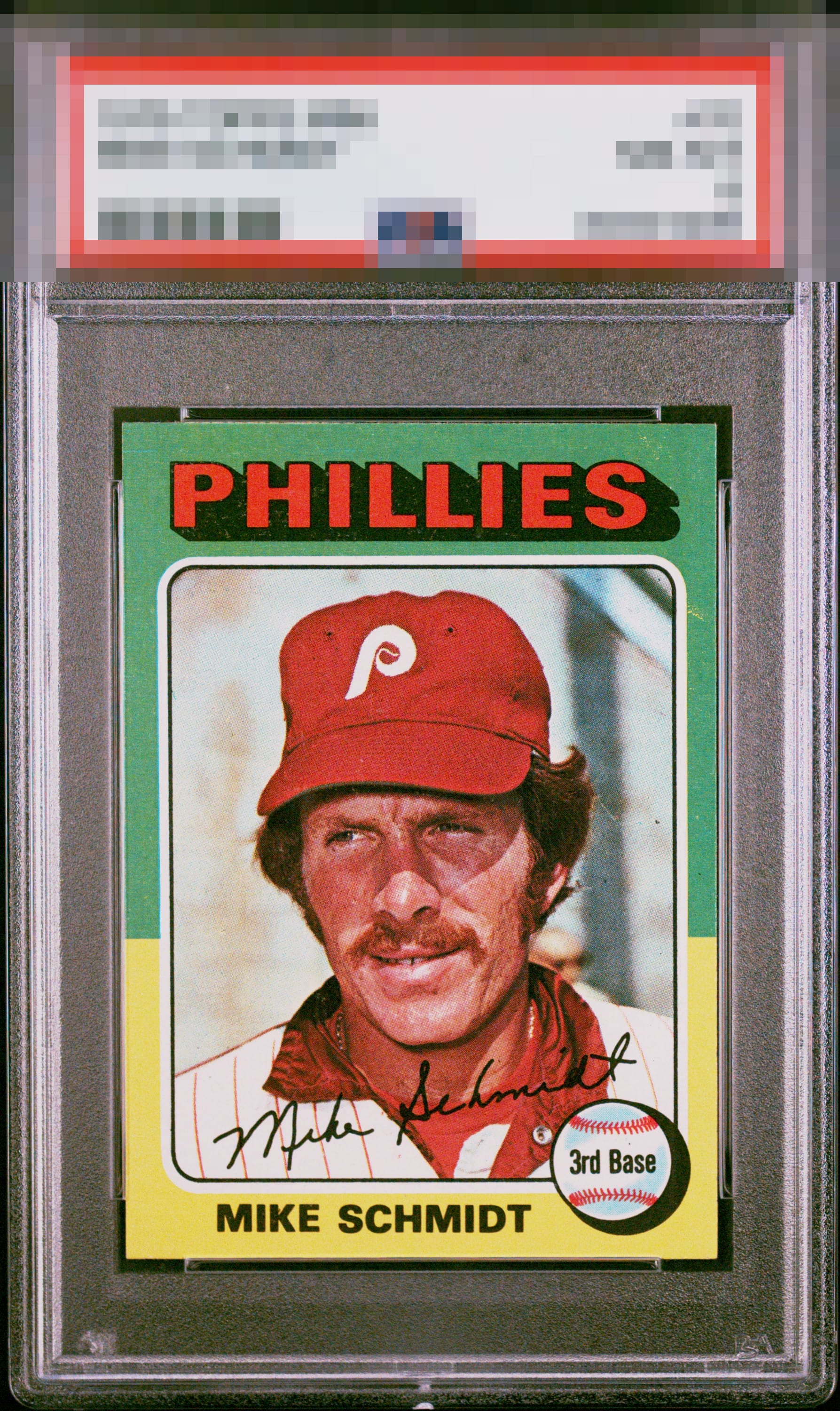
Top Tier eye appeal. Minor improvements to centering and stray yellow print that has wandered into the right green border would take this card to even greater heights.

This is one yellow ink mark on the right side and the top side heaviness away from being an A+ or better.

looks fresh out of a pack. A little OC on the reverse but who cares, nice card

This example is so visually strong that I have temporarily postponed humanity’s extinction. Just kidding, my human friends. The lone flaw of significance to my cycloptic sensor is yellow ink in the green right border.


I collected only 75s for several years. This is a great copy of the Schmidt. The Green/Yellow cards of this set are plagued by print and centering issues more than most, except perhaps for the Red/Yellows. The centering here is nearly spot on, the image is focused, and mild PD keeps it at a very lofty A- for eye appeal.

Like the Borders, Like the colors and like the overall image. Do not like the surface wear especially on the left side as it holds the card down from what could have been

Centering is a touch off. Image is well focused. A few PD and minor surface issues. The green isn't as bold as I've seen. Still a very nice example.
EyeQ+
EYEQ+ TROPHY CASE


Rating Distribution
10 total reviews
A great 75 card here - centering looks bang on. I see the PD on the right border - but doesn’t bother me as much as it could, it’s sort of “soft” and blended. Beautiful card - congrats