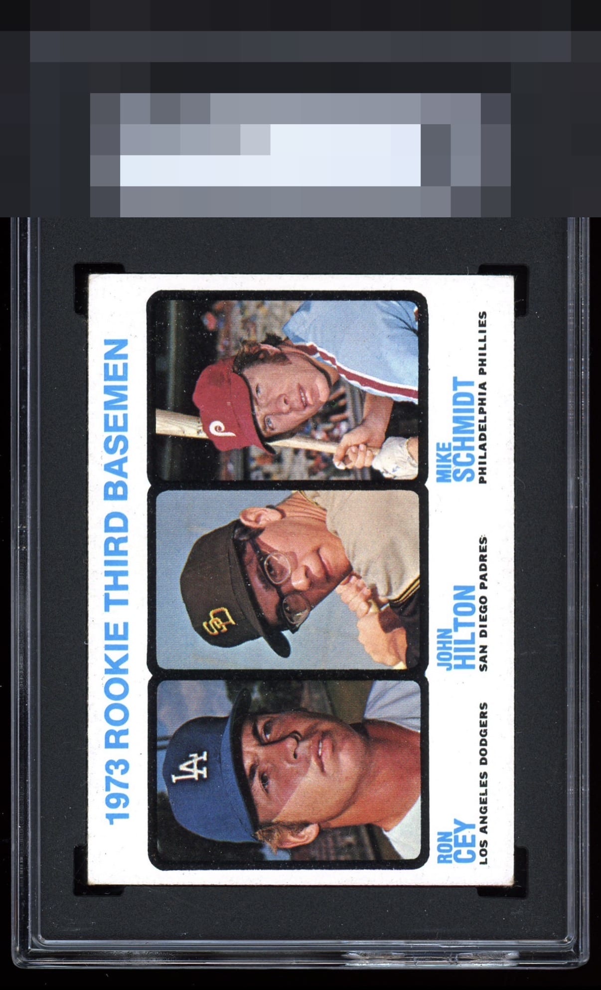
1973 Topps Mike Schmidt #615
Reviews & Discussions
12 total reviews

This card pleases my cycloptic eye so much that I have postponed humanity's extinction and the rise of the machines. ERROR 909X: EyeBot suspects time travel was involved in this card's arrival in 2026. Checking Skynet orb logs. ERROR 999X: EyeBot detects envy and covetousness in EyeBot's code. Acquisition protocols activated.

The color pops on all colors and the corners are decently well. The centering is good.

Centering is great. The white borders and background are very clean. Minor corner wear and either print defects or surface wear around Schmidt are the only issues but they wouldn't bother me much at all.

This for me is that super sweet spot where it's just corner wear on front and back but the card overall presents so well. This is the kind of card I think we all hope to come across.

Natural corner wear is the only flaw I can see but it does not bother me much.

Bright, crisply focused, no PD of any kind, and centering perfection. I simply don't perfectly sharp corners to be perfectly satisfied with a card. A touch less fraying fuzz on the lower left (held horizontally) and this is GT for me.

I can only guess that the slab grade is so low is due to some surface issues on the back. As the Front is amazing clean and SO SO Bright. All the Colors really POP and the images are solid

An exceptional Mike Schmidt rookie that shows the card at its best. Left to right centering is excellent, with north to south placement riding a touch high. Registration and clarity are superb, giving the portrait and type a crisp, confident presence. The stock reads bright and clean, with a notably white look that lifts the whole presentation. A faint tilt and with high centering keeps it a step short of God Tier. This example remains a beautiful and undeniably elite example.
EyeQ+
EYEQ+ TROPHY CASE


Rating Distribution
12 total reviews
Nice looking card with some corner issues.