1957 Topps Mickey Mantle #95
Reviews & Discussions
8 total reviews


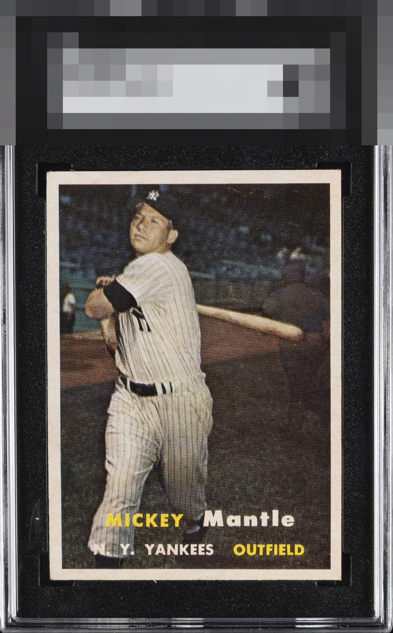
Well-centered with good color. The image is a bit out of focus and has some snow in the background.

This copy is refreshingly free of the snow that so often plagues this issue, allowing the image to breathe with rich color and crisp contrast. The white borders present bright and clean, giving the card a notably strong overall look. The only element keeping it from a firm A, and with perfect centering from true God Tier status, is the mild shift in centering, but within its tier it still stands out as an outstanding example. Excellent card.

Strong eye appeal right here. The face is a bit out of focus, which is best seen by using the COMPARE feature. The centering is very good and the borders are very clean, which stands out on such a dark-background card.

very nice looking card. Nice sized borders but they are mis-sized and the left/right is off center The details and image are solid. Better than the slab grade

EyeQ+
EYEQ+ TROPHY CASE


Rating Distribution
8 total reviews
A lovely copy, with image blur and a tiny centering shift the only flaws worth citing to me.