1957 Topps Mickey Mantle #95
1 / 2
💬
Reviews & Discussions
12 total reviews

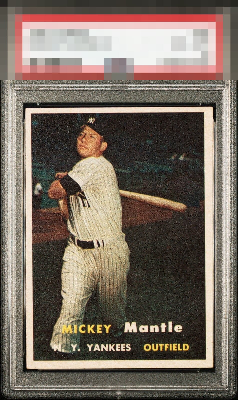
Here I like the contrast, yet the focus is less than ideal, as is the centering. There is also some roughness to the surface, a patina that may 57s can exhibit.


This has the background coloring that I love with vintage. Above average centering. Excellent example

The image itself is nice and clear, but with light snow on the left side and centering noticeably off, it wouldn't be the first card I go after.. Especially at the price of a '6'

Surface distracts from the rest of the card. Also off centered.

I like the contrast in the image but centering is off both ways too much for my taste.


10 reviews
2 reviews
EyeQ+
101.0
Global Population
28
POPULATION ACROSS ALL GRADES AND GRADING COMPANIES
Global Eye Rank
#10
Population in Grade
4
POPULATION IN THIS GRADE ACROSS ALL GRADING COMPANIES
Eye Rank in Grade
#1
EYEQ+ TROPHY CASE

10th Place
GLOBAL

1st Place
IN-GRADE
📊
Rating Distribution
12 total reviews
G
0%
A+
0%
A
0%
A-
1 rating
10%
1
B+
1 rating
10%
1
B
2 ratings
20%
2
B-
2 ratings
20%
2
C+
4 ratings
40%
4
C
0%
C-
0%
D+
0%
D
0%
D-
0%
F
0%
slight tilt and centering distract.