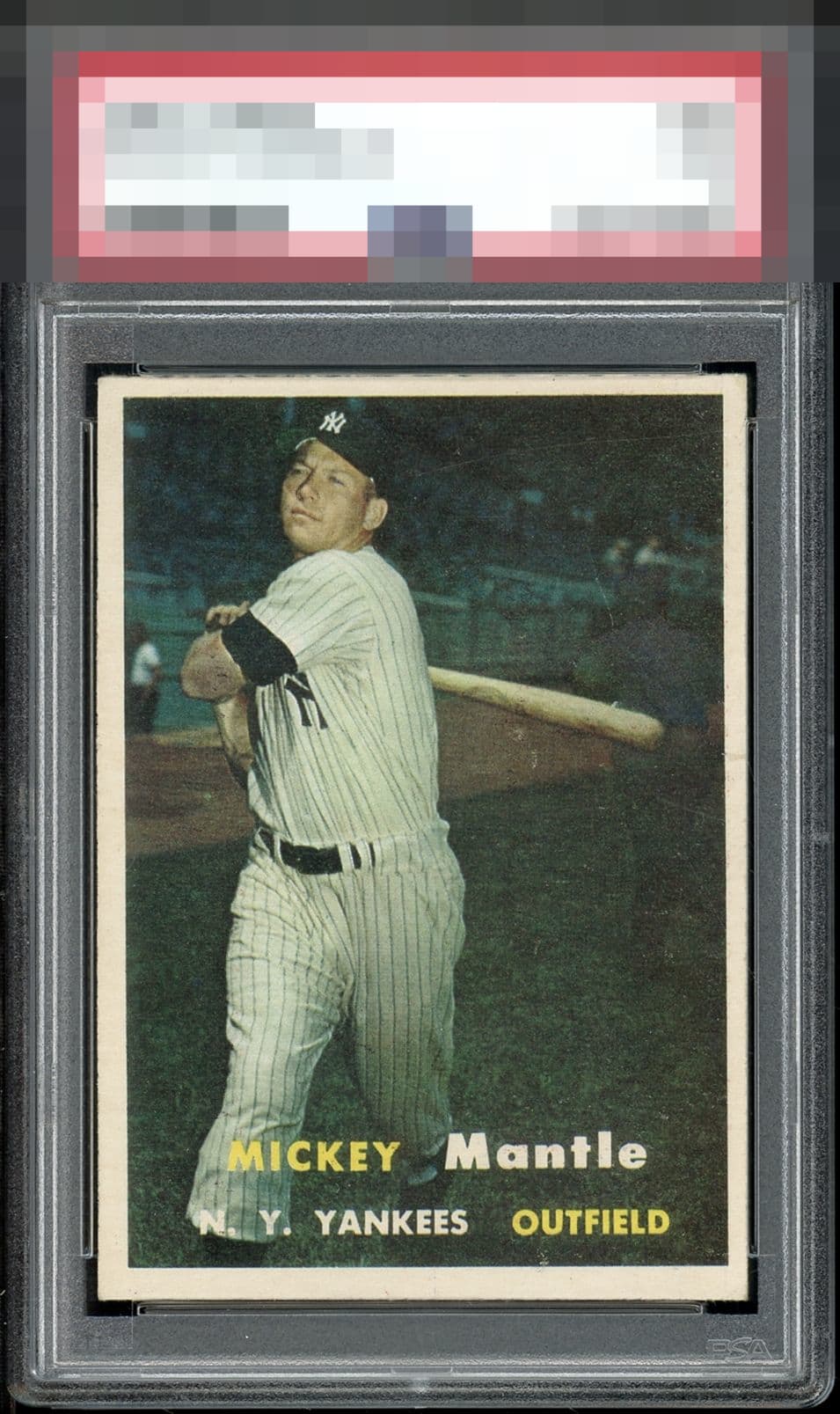
1957 Topps Mickey Mantle #95
Reviews & Discussions
12 total reviews

My eye is pleased more than I would expect with this level of centering shift both ways, and that is because of the level of focus in his face.

Image sits noticeably high within the borders and tough to ignore. Otherwise stellar copy that deserves a high technical grade and relatively high EyeQ+

As with so many of the 57 Mantles, the centering is seriously off.


Looks better from a distance but card is off centered and the surface doesn’t come across very striking.

Clean card and not too much different to how it looked when it emerged from the pack. That being said, centering and tilt prevent it from being one I would love to own and enjoy seeing daily in my display.


Nice looking card. Nice image and colors. Centering is the opportunity

EyeQ+
EYEQ+ TROPHY CASE

Rating Distribution
12 total reviews
I am sensitive to tilt and this one makes me dizzy. otherwise a beauty.