1957 Topps Mickey Mantle #95
1 / 2
💬
Reviews & Discussions
12 total reviews

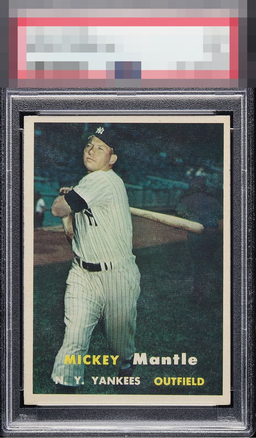
Boy do I like the contrast and focus, the centering is just a bit aggressive is all.

Really nice looking example aside from the centering. Clean borders although varying in size. Clear focus and registration of the mick with very limited snow


good looking card but the borders hurt it from being off center to the minor discoloring that the borders are experiencing.

10 reviews
2 reviews
EyeQ+
108.0
Global Population
28
POPULATION ACROSS ALL GRADES AND GRADING COMPANIES
Global Eye Rank
#7
Population in Grade
2
POPULATION IN THIS GRADE ACROSS ALL GRADING COMPANIES
Eye Rank in Grade
#1
EYEQ+ TROPHY CASE

7th Place
GLOBAL

1st Place
IN-GRADE
📊
Rating Distribution
12 total reviews
G
0%
A+
0%
A
0%
A-
0%
B+
1 rating
10%
1
B
3 ratings
30%
3
B-
4 ratings
40%
4
C+
1 rating
10%
1
C
1 rating
10%
1
C-
0%
D+
0%
D
0%
D-
0%
F
0%
all good but centering