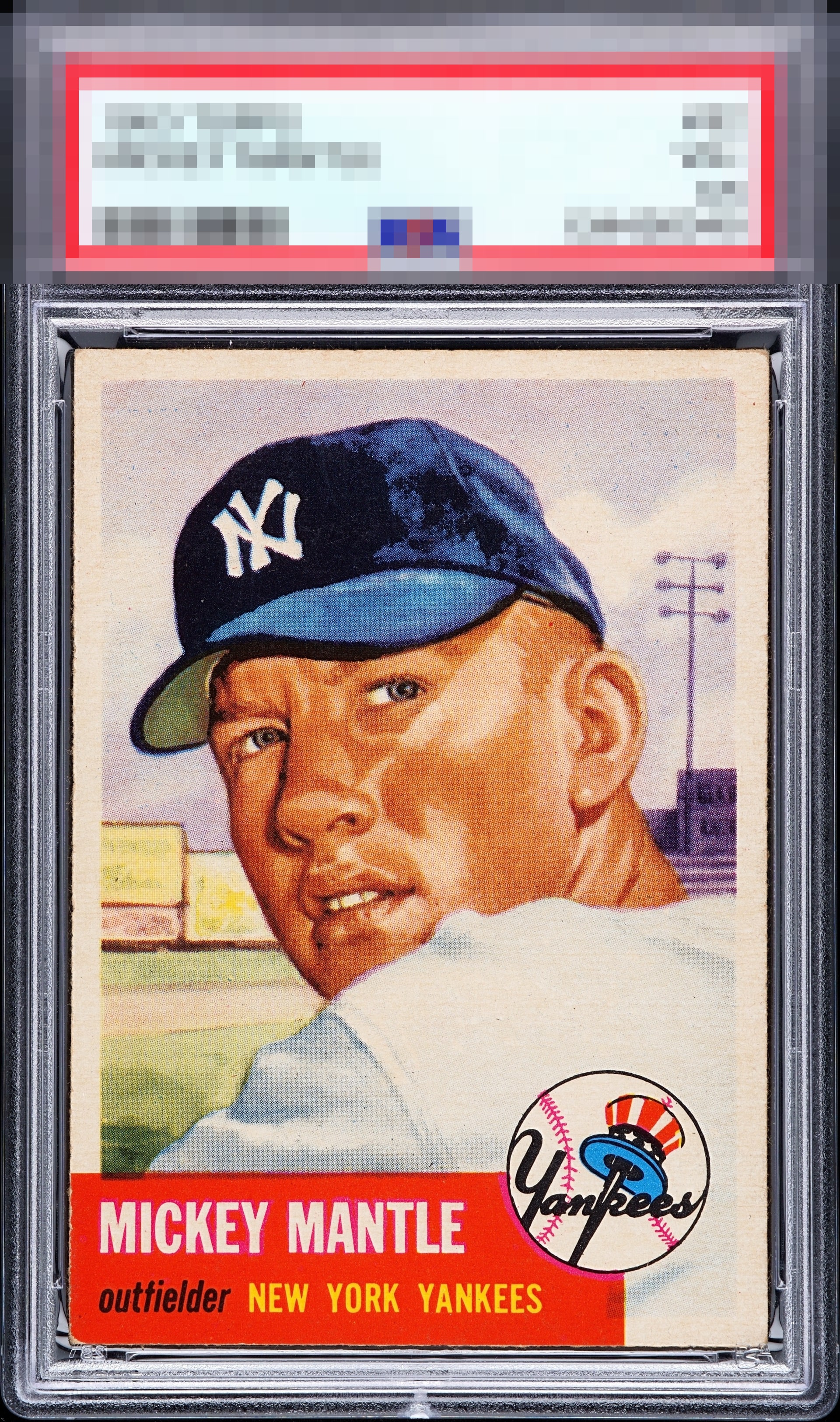
1953 Topps Mickey Mantle #82
Reviews & Discussions
5 total reviews

Nice image and the color looks good and bright. Clean surface as well. Centering is a little off left to right and there is some minor corner wear, but overall a great looking card.

This reminds of another, near-identical 53T Mick I recently reviewed. My first, strong instinct is that this card has top echelon eye appeal-- and nothing emerges on a longer look to change that verdict. It's more about calibrating where it falls within the top tier. The centering, most visible when comparing the side border widths at their top, help me land on A-. The notorious red corner is in great shape.

this is my favorite Mantle Card. I love the look of this one and the strong colors and solid image and it jumps off the page. There is minor issues at bottom edge and corner of red box but it is very minimal.

Beautiful image and great color. A touch on the bottom left corner and subtle tilt.

EyeQ+
EYEQ+ TROPHY CASE


Rating Distribution
5 total reviews
This card survives my cycloptic scrutiny with its dignity very much intact. A high eye appeal showing, with low volume flaws noted.