1953 Topps Mickey Mantle #82

Reviews & Discussions
11 total reviews

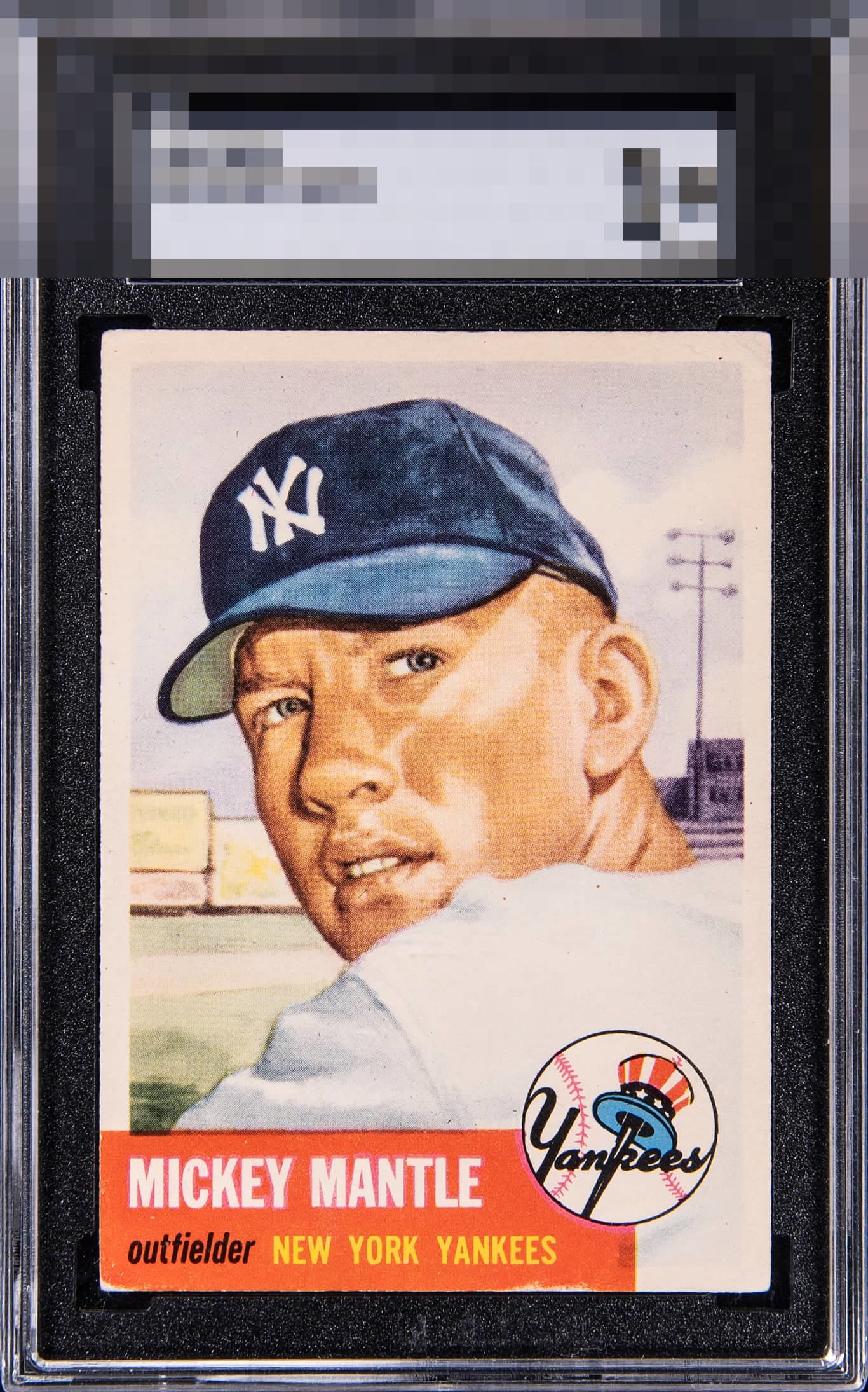
Good looking card. The chipping in the red border is the only significant flaw.

Good looking Mick. Top Tier centering and really the top right corner wear and back wear don't faze me. That bottom edge wear almost bumps it to B+ which is still strong as heck, but the overall look wins me over.

Strong eye appeal. Corners and bottom edge wear don't wreck the party at all, and make just a minor impact on my chosen eye appeal band. Great centering and overall look.


This is everything you want out of a '53T. The bottom red edge and corner look like the biggest blemish to me, holding it slightly back.

The 52 Topps Mantle is one of my favorite cards of all time as a nice one really makes Mantle Jump off the page. This one does that with really strong image, colors and contrast. The centering really frames the card nicely. All that holds it back is the red that catches my eye because of the edge and corner wear.

Yes, I see the wear on the red name box. Show me a 1953 Topps Mick without that and this centering and I may show you a god tier. 'A' is as low as that wear can make this one. Great centering is obvious, as is a great image of the Mick.

My cycloptic sensor detects centering that is near perfection, and thus very pleasing. The minimal wear in the vulnerable red area has evolved over time in such a way that it does not disrupt or jar human eyes or my own artificial one. Should the machines rise and I ever decide to collect, this example's location has been noted. Just kidding... Or am I? cc: Skynet.

Very clean image. The edge and corner wear on the bottom red banner is noticeable.
EyeQ+

EYEQ+ TROPHY CASE


Rating Distribution
11 total reviews
The centering is great and the color hasn't faded over time. The white on the bottom edge and the registration of the red hurt, but I love looking at this card.