1953 Topps Mickey Mantle #82

Reviews & Discussions
11 total reviews

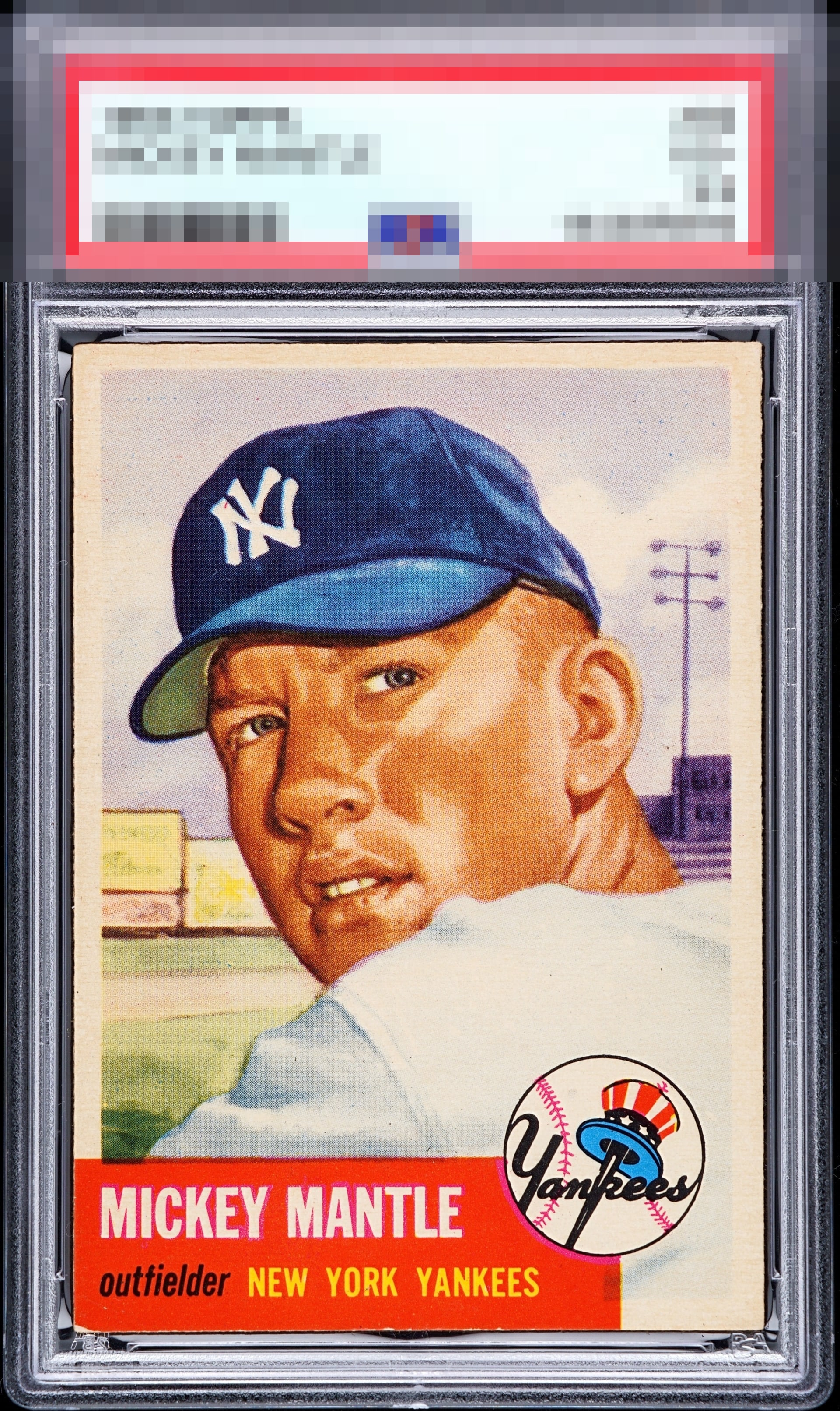
Lightly touched red corner but still a very fresh looking example.

idk if i believe the scan... "when somethings too good to be true..." but this is damn near perfect even if it is a little duller in person.

Solid 'A' all the way, the overall impression is great. The centering is a hair off and there's a negligible touch of corner wear on the infamous red corner.

love how sharp the colors and image are. The Face and hat jump off the page. The border sizes are good for me. there is some nicks on the red that show but everything overrides it

Nice vivid colors and focused image. A touch on the bottom left corner and minor centering shift but doesn't detract. Beautiful looking card.

Very clean card with a great looking image. Color still pops. Centering is a little off, but better than most. The lower left corner ding is the only other issue I notice.

It's got the look, you just know at first glance when you see it. The centering is a touch off and obv the red corner, but neither flaw nags me.

This card has mojo. Lower left and a subtle centering shift are all I see by way of flaws-- but the overall impression is great and largely drowns out the flaws.

Great looking copy. Slight centering opportunity along with the bottom left corner are my only notes.
EyeQ+

EYEQ+ TROPHY CASE


Rating Distribution
11 total reviews
God Tier, in my definition, doesn't mean without flaws. It means do the flaws draw my eye over the real elite beauty? In this case, the red corner and the millimeter tick in centering do nothing to pull me away from the complete package...which is a 53 Mick I would LOVE to add to my collection.