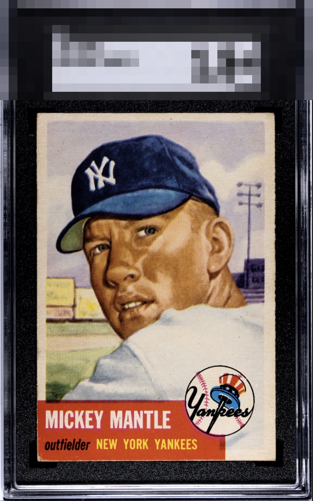
1953 Topps Mickey Mantle #82

Reviews & Discussions
10 total reviews

Great looking card with minor corner wear and centering the only issues for me.

Beauty. Bottom left corner and a touch better centering away from the next tier imo.

This is high eye appeal and my gut says it is right on the cusp of those "A Badges!"

This is a strong 53 Mantle with the kind of visual presence you want from the issue. The color sits confidently, the print registration is crisp, and the centering presents very well at first glance. The Yankees logo carries a deep, clean black, and the red holds up nicely without looking tired or washed. Yes, the lower portion, especially that bottom left area, keeps it from feeling truly pristine, but it’s a contained flaw. It doesn’t hijack the eye or cheapen the portrait. Overall, this is an excellent card with real polish and only a minor issue to me.

Very strong eye appeal. Were one of the left corner or centering improved, this cracks into the A Tier. Great copy.

Colors and image really stand out. Centering is a touch high and some corner wear on the red border are the only minor things that draw my eye.

Clean card, image looks great. Centering top to bottom is off and some minor edge and corner wear lower the grade slightly.

My first instinct was B+ then a longer look maintained that feeling. The flaws to my eye are centering and corner wear but they are mild and do not add up to much. High eye appeal on this card.

The colors and image really POP and the image jumps off the page and the card has nice borders(size is nice but partially off center). THe red box and the nicks/damage on the cornes and edges is a bit more distracting then i would like / But those colors really creates nice eye appeal

EyeQ+
EYEQ+ TROPHY CASE

Rating Distribution
10 total reviews
Nearly perfect. Definitely a card that deserves an eye appeal premium. Edit: I’m astounded at the grade of this card. I guess I missed some creasing. Any creasing on this card wouldn’t bother me much.