1953 Topps Mickey Mantle #82

Reviews & Discussions
11 total reviews

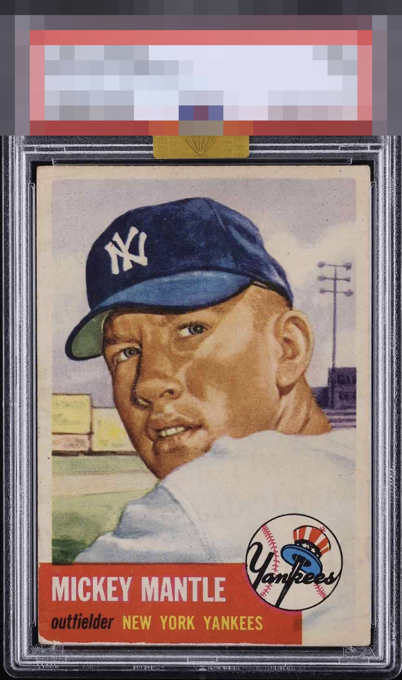
Only the wear on the bottom left really sticks out to me. There may be creases that I’m not seeing but it looks like a keeper to me. The MBA gold sticker makes me think this card is one of the lower grade beauties we all search for if we’re not in the market for a high grade example. Edit: Wow a PSA 1. I don’t care what flaws drop it to that grade, this is a card I’d gladly keep in my collection for many years.

I have shopped for this card extensively, and can say finding this exact centering is very, very hard. That lower left is really all I can see in a normal viewing setting that detracts.

Tough card to find centered. This one is very close. Maybe a touch thin on the top. The bottom left corners have issues on the majority of this issue. Great looking card.

That lower left corner is a bear. With centering and a clean surface like this, this specimen can withstand that corner wear and still land in the A Tier,

This has super eye appeal, and breaks into the top zone of badges for me. That pesky and commonly worn lower left is all I can cite that affects my viewing pleasure.

Great looking card, nicely centered. Image looks nice as well. Some light surface toning and corner wear and edge chipping along the border of the red box are the main issues.

Eye Examine for the Slab doctor please Nice colors and nice sharp image The borders are nice sized and centering is ok The hold back is the light surface wear and the damage to the bottom that stands out against the red box

Well-centered with a very nice image. So much better than the technical grade. A little bit too much wear on the red corner which holds it back a bit.

EyeQ+

EYEQ+ TROPHY CASE


Rating Distribution
11 total reviews
That left corner and edge is the only aspect that dampens eye appeal to me. The centering is fantastic. It just comes down to the degree of wear on the red corner.