1953 Topps Mickey Mantle #82
1 / 2
💬
Reviews & Discussions
5 total reviews


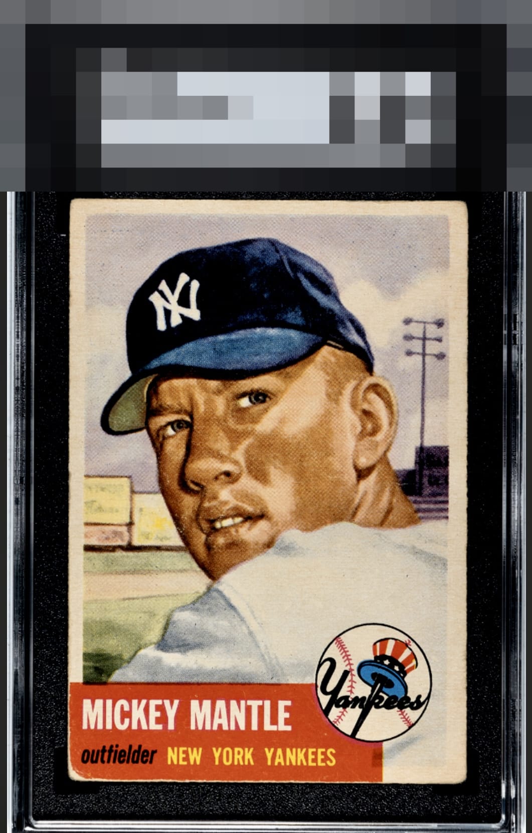
I truly do not like the red box and the nicks that impact the appearance of the borders and corners of it But the image and the colors and the Boldness of the Face overrides all for me

Strong colors and relatively well-centered. Bottom left corner shows a bit more wear in the red.
4 reviews
1 review
EyeQ+
--
Global Population
38
POPULATION ACROSS ALL GRADES AND GRADING COMPANIES
Global Eye Rank
—
No Eye Q+ score
Population in Grade
3
POPULATION IN THIS GRADE ACROSS ALL GRADING COMPANIES
Eye Rank in Grade
—
No Eye Q+ score
EYEQ+ TROPHY CASE

GLOBAL

IN-GRADE
Trophies appear here when earned.
📊
Rating Distribution
5 total reviews
G
0%
A+
0%
A
0%
A-
1 rating
25%
1
B+
3 ratings
75%
3
B
0%
B-
0%
C+
0%
C
0%
C-
0%
D+
0%
D
0%
D-
0%
F
0%
This card shows what a great, clean, unobstructed image can do for eye appeal despite serious corner wear. I think part of the alchemy here is that this card is a big portrait effectively, and so when that aspect is great, the human eye just hangs there and enjoys it. The red Achilles of the 53T Mick prevents passing through the velvet rope into the A Tier; if that red held it together a little better would slide in.