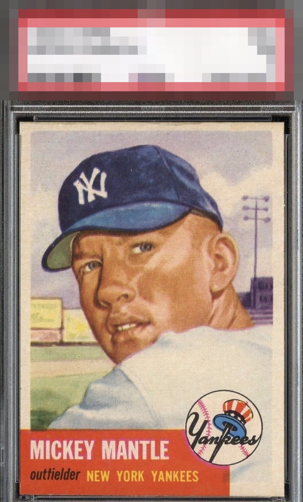
1953 Topps Mickey Mantle #82

Reviews & Discussions
10 total reviews

Impressive. I always look at the name plate on any 53T and this one is chip free. Centered a touch high but the design hides it well & it’s not distracting at all.

Once that bottom left corner looks that sharp, the rest of the review is almost academic. This one has a whole lot more than that going for it too. Slight OC towards the top keeps it at a modest A+.


The image looks great and really stands out. The area around the red box is in excellent condition. It's very rare to see no edge or corner chipping in that area. Top to bottom centering is the only issue.

This copy looks to be in amazing shape to me, and it's rare for me not to notice any issues within the red area. I’m excited to finish this review so I can see what the technical grade is. My only note is centering.

Top Tier Eye Appeal no question, and that red corner deserves its own separate God Tier Status Badge. With that said, the top edge wear and high centering are the flaws that I take into account.

Very special card with a very high eye appeal badge. That red corner deserves to be shouted out! Corners are freaky sharp. A touch of centering and that top edge damage are what separates this card from A+ and GT status. Beauty!

IF the borders were cleaner and brighter the sky would have been the limit. As is it is a Great Piece with Strong Colors, Clean Background, and the Main Image has the WOW factor

Colors and image of Mantle present very well. The red name box has virtually no edge wear and free of any blemishes. A bit of edge wear on the top border. A touch off-centered but a very beautiful and clean card.

EyeQ+
EYEQ+ TROPHY CASE

Rating Distribution
10 total reviews
i can never trust a card this old with corners like that. but the grade here is earned by the pure red block, good color, good centering.