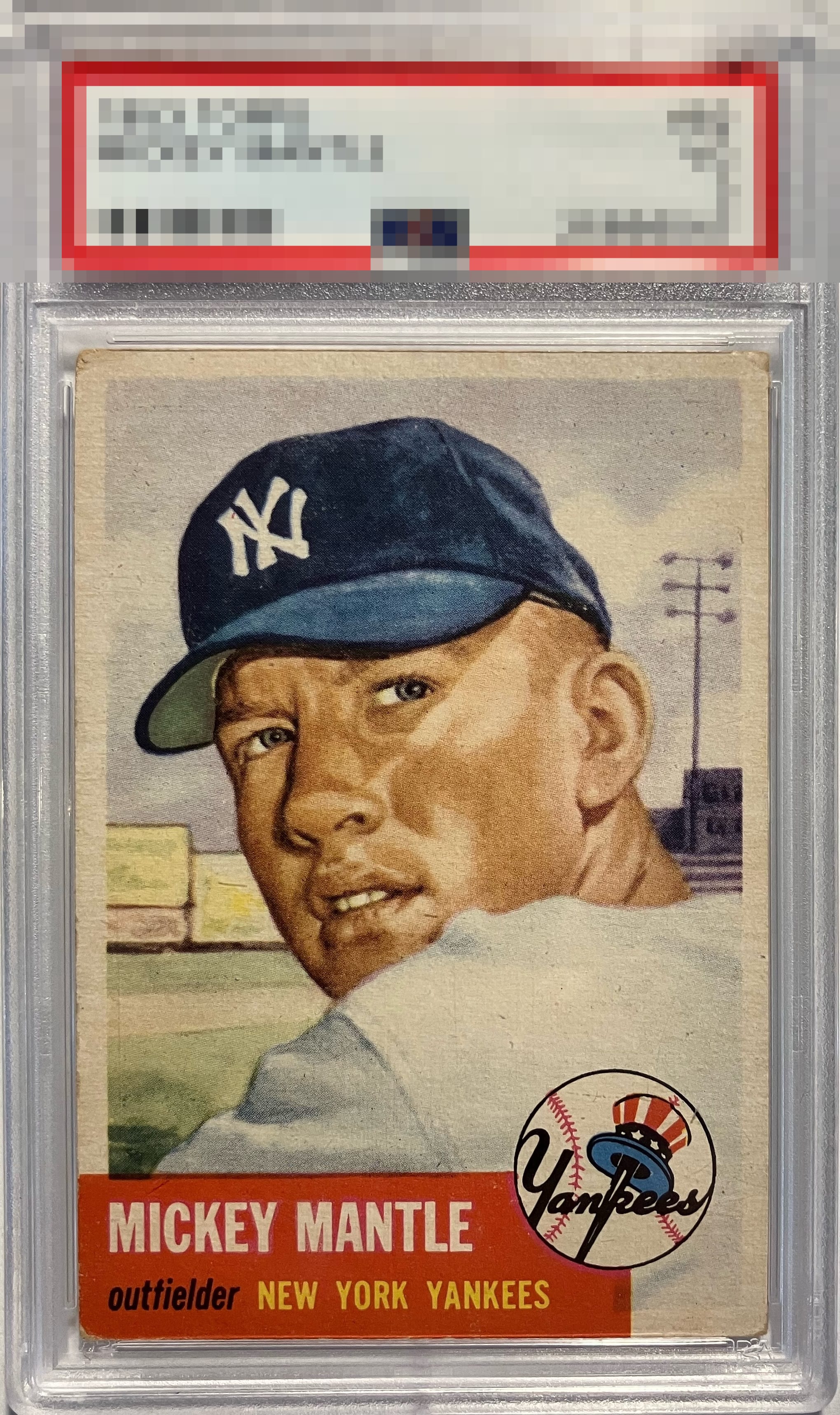
1953 Topps Mickey Mantle #82

Reviews & Discussions
6 total reviews

Great detail and focus on his face and top notch centering. Corners appear to have honest wear and the color is just slightly subdued but there’s a lot to like here.

My eye responds to the centering and image quality. The wear on this card is relegated to the corners and that is when, for me, a card can really be pretty despite wear. Such is the case with this specimen.

The card is centered well. These are hard to find well centered. The condition of the borders are an issue as they show signs of wear and they are discolored and the corners are not well. The image itself is strong and the colors POP

Love the colors and image. Well-centered and the red name box looks good. A few minor blemishes in the background.

My eye goes to centering first and I weigh that very heavily in my scoring. This card has elite centering, a true rarity for a 53 Mick. The image color is also fantastic with the blue cap presented especially bold. Corner are rounded and sadly the lower left red corner has lost some of that red. Pound for pound a great copy though and one I would absolutely love to own.

EyeQ+
EYEQ+ TROPHY CASE


Rating Distribution
6 total reviews
Natural toning, nice image with minimal distractions.